The creation of Paper Opera
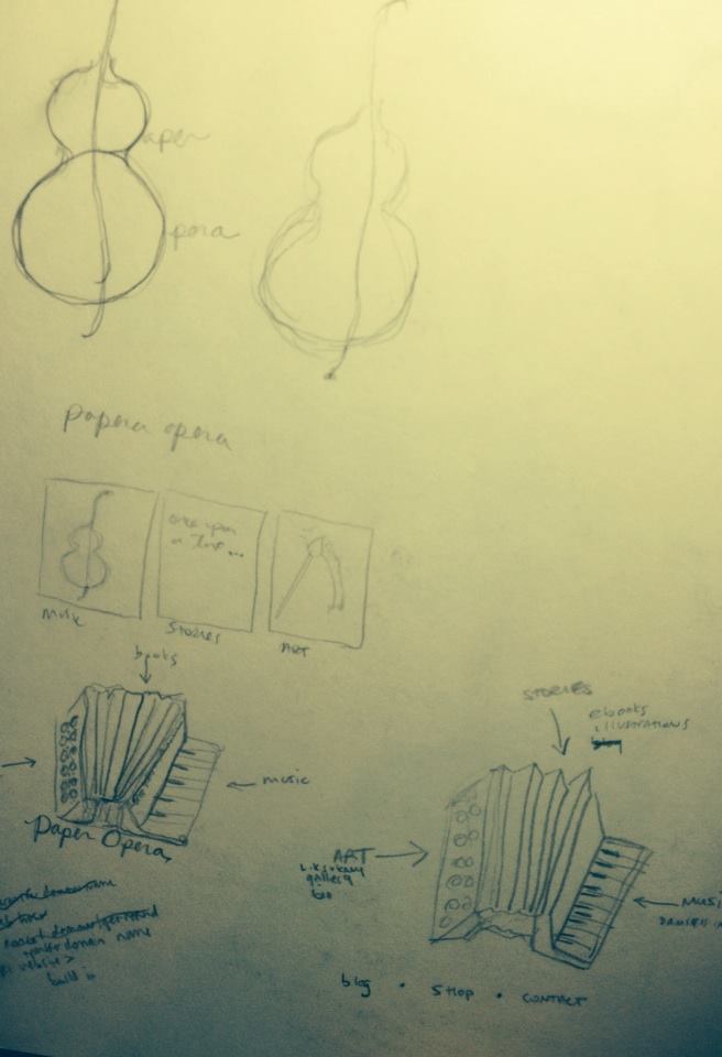
Once I came up with the name Paper Opera – which took a couple of years to define what the art, music, and writing that M and I were doing – I went ahead and purchased the domain name through Reg123. This was August 2012. I knew what I wanted the Paper Opera website to offer (full art gallery, audio and video space for the Damsels in Distress with purchasing options, ebook capabilities, a full shop, and a news or blog update area). After researching my options, the general pricing to build something this significant was about $5,000. With no money in my art account I decided to use the free options and connect them all through one location.
The online components of Paper Opera
ART: The art gallery I built in Wix in February 2014, and used the L.K. Sukany artist name. Although M will create an occasional painting, he doesn’t really work too much in the fine art medium. I wanted something professional, like an online portfolio. It took me applying for a job I really wanted to actually build the online portfolio. After not getting the job, I reworked it, and am still finding pieces I have not photographed to add. I am still not 100% satisfied with the artist site, and am open for suggestions.
Music: For the Damsels in Distress site we went with Bandcamp in May 2014 because it was the easiest to understand and least complicated for others to use – anyone with internet access can use it. Because the free bandcamp doesn’t have video capabilities, we created a Paper Opera Youtube channel in May 2014 for videos.
Stories: With the ebook/self publishing, Lulu was the most recommended and we opened an account in March 2014. We have many projects in the works on this front, so all I can say is “coming soon” for this feature.
Shop: The Paper Opera shop is on Etsy and was started March 2014.
Paper Opera: All of these are linked from the artist website in Wix as well as the Paper Opera site in WordPress. We transferred the domain from Reg123 to WordPress in February 2014 because there was a better free interface.
The Logo
I wanted to design a logo for Paper Opera that had whimsical qualities and that would express the themes of art, music, and writing. I also wanted a design that would look good on the web (website banner) and in print (for business cards).
I knew I wanted to have an instrument in the logo from the beginning. I played with the tambourine or drum using the “O” for “Opera” and working in the name “Paper Opera” somehow. It turned into a cello and paintbrush. But the only thing I could see the cello as was a woman’s body and then she was playing herself, and it just kind of got weird.
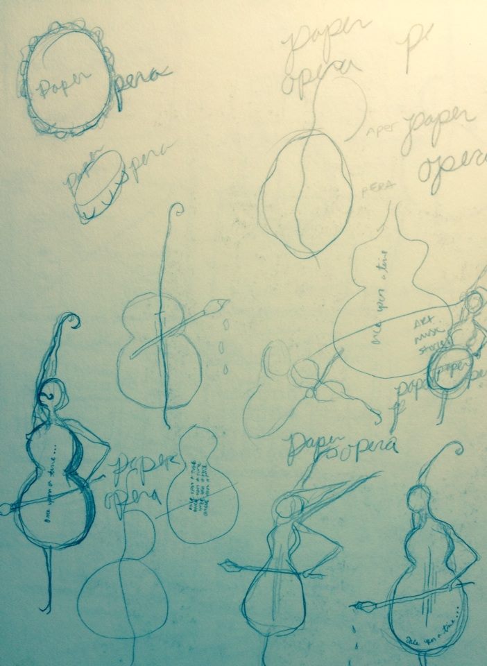
So I transitioned from the cello to the accordion. There is something so whimsical and quirky about the accordion. I started playing with the accordion buttons as maybe a paint palette.

I designed this amalgamated object (accordion, paper, and a watercolor tray).

It just didn’t work in portraying the playfulness I really wanted in the logo. It also seemed really stiff – the design did.
I thought about how whimsical my damsels drawings are and thought about using that approach.

I took The “Dancer” and created this type of layered image with a circle to define the space and the accordion as a embellishment.
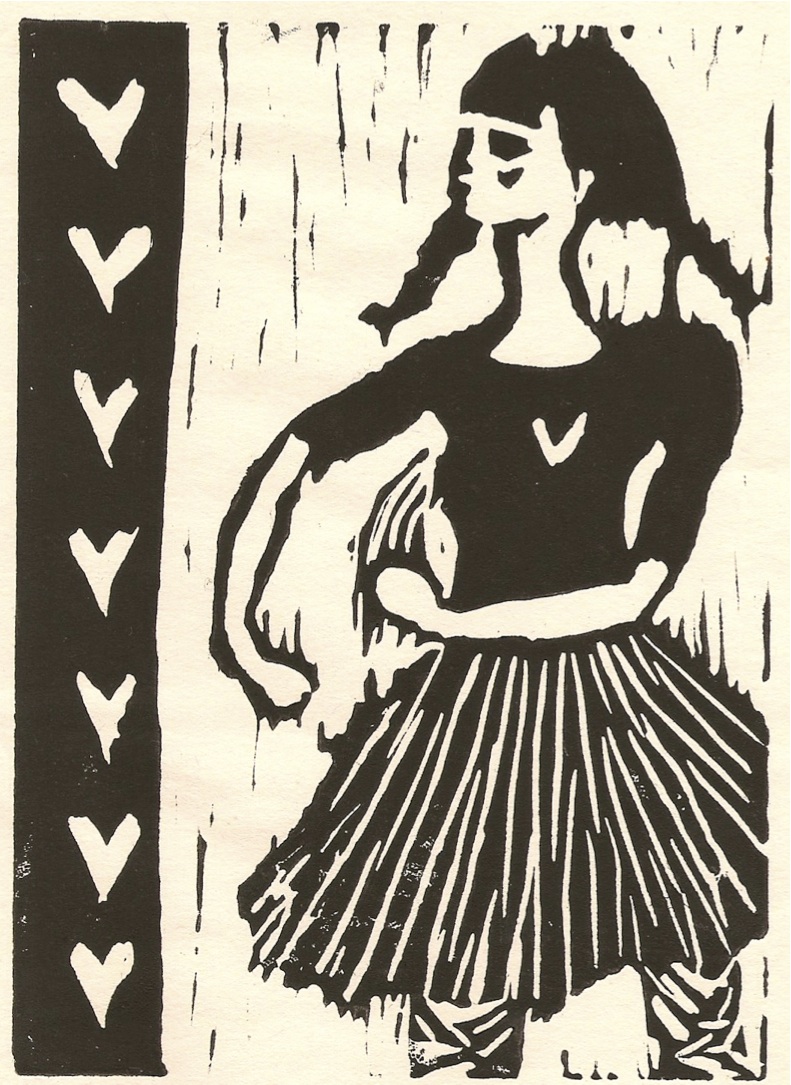

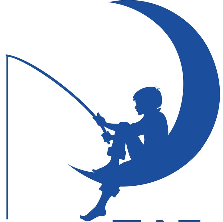
It just felt too forced, too clean, and I didn’t really want to use “The Dancer” for the paper opera logo. But I really liked the format of a figure in a circle and the logo words in the circle. I thought about the Dreamworks logo of the boy sitting on the moon and fishing. I really liked how the image evokes the idea of using imagination and has an element of being carefree.
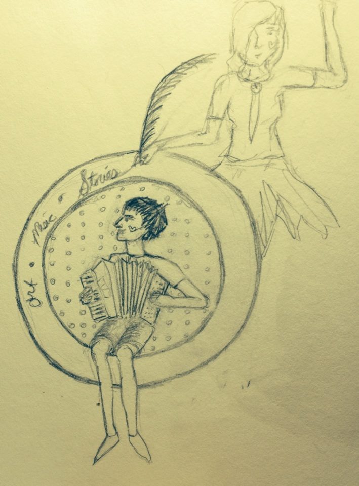
I wanted something similar to that idea. I thought about it for a while and made this sketch during a sermon at Grace Church. The boy playing the accordion and sitting in the circle as if it were a swing, and a girl dancing while simultaneously writing or drawing with a feather behind the circle. It just seemed too busy for a logo.

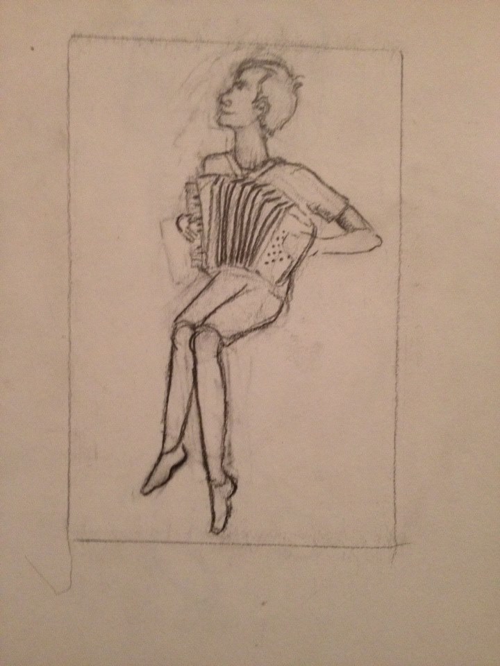
I liked the bones, and decided this was something I could work with. I drew M sitting on a bar stool playing the accordion.
Once I had my drawing, I took a photo of it, and opened in Photoshop. I put a lot of texture effects, changed the figure a bit, and added the circle and key words – art, music, stories – within the logo. I admit, typography is not one of my strengths, but I like the look of cursive quite a bit, so that’s what I used for my text.

M and I have been doing Paper Opera the whole time we have known each other – over 8 years. It has been less defined and more abstract at times – sometimes floating around in our heads and our hearts – other times in a simple melody. Paper Opera is the online version of our art, music, and stories that we can share with you!

My beautiful niece and her beautiful mind, Love to see how it unfolds. Aunt D
Thanks Aunt D! You are also beautiful with a beautiful mind. 🙂
Thanks for a glimpse into your creative process. I can’t wait to hear about your adventures in Romania!
Thanks Linda!
Love the bond that you & M have through this!
🙂
Lauren Sukany’s thinking process, goes well out of the normal perameters of one’s observations. A few years back I read a book ” How to Think Like Leonardo De Vinci;” what is the thinking process of Leonardo? Much of what I see in Lauren’s reasoning and observations in getting the desired result is much the same; I would add that I see some of Walt Disney in the results as the Dreamworks logo, and it is how the concepts and ideas form on paper first; drawn then re-conceptualized into the final product. For other artist and people who fancy concepts, processes, and want to know better how to express and define themselves as artist; I would recommend attending one of her shows.