Art Show at Tea Bar and Bites

Tea and Bar and Bites is an amazing place. It’s this little cafe on Pickwick that we like to walk to and enjoy a pastry at every now and again.

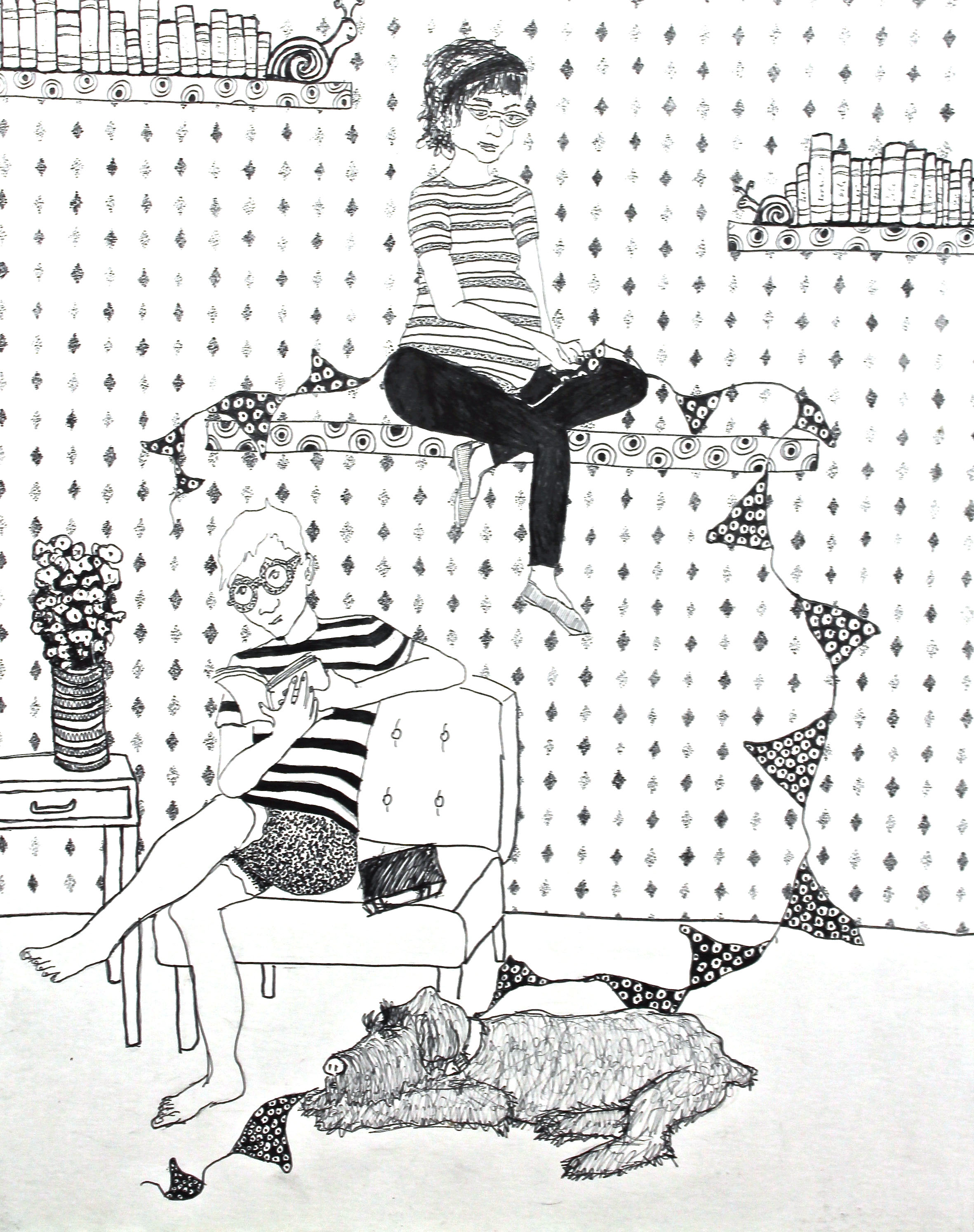
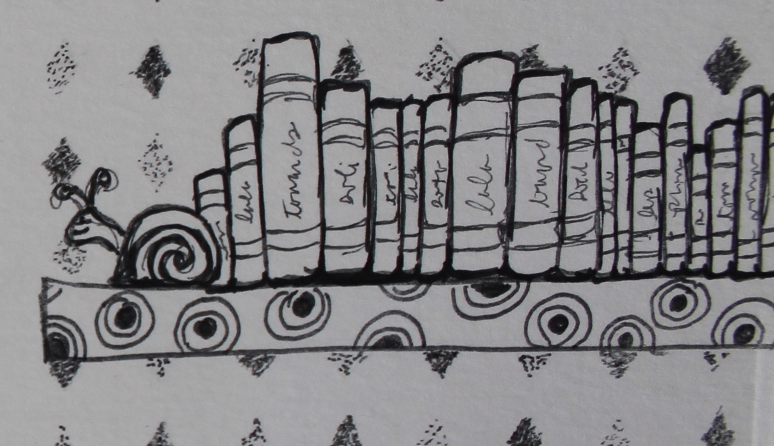
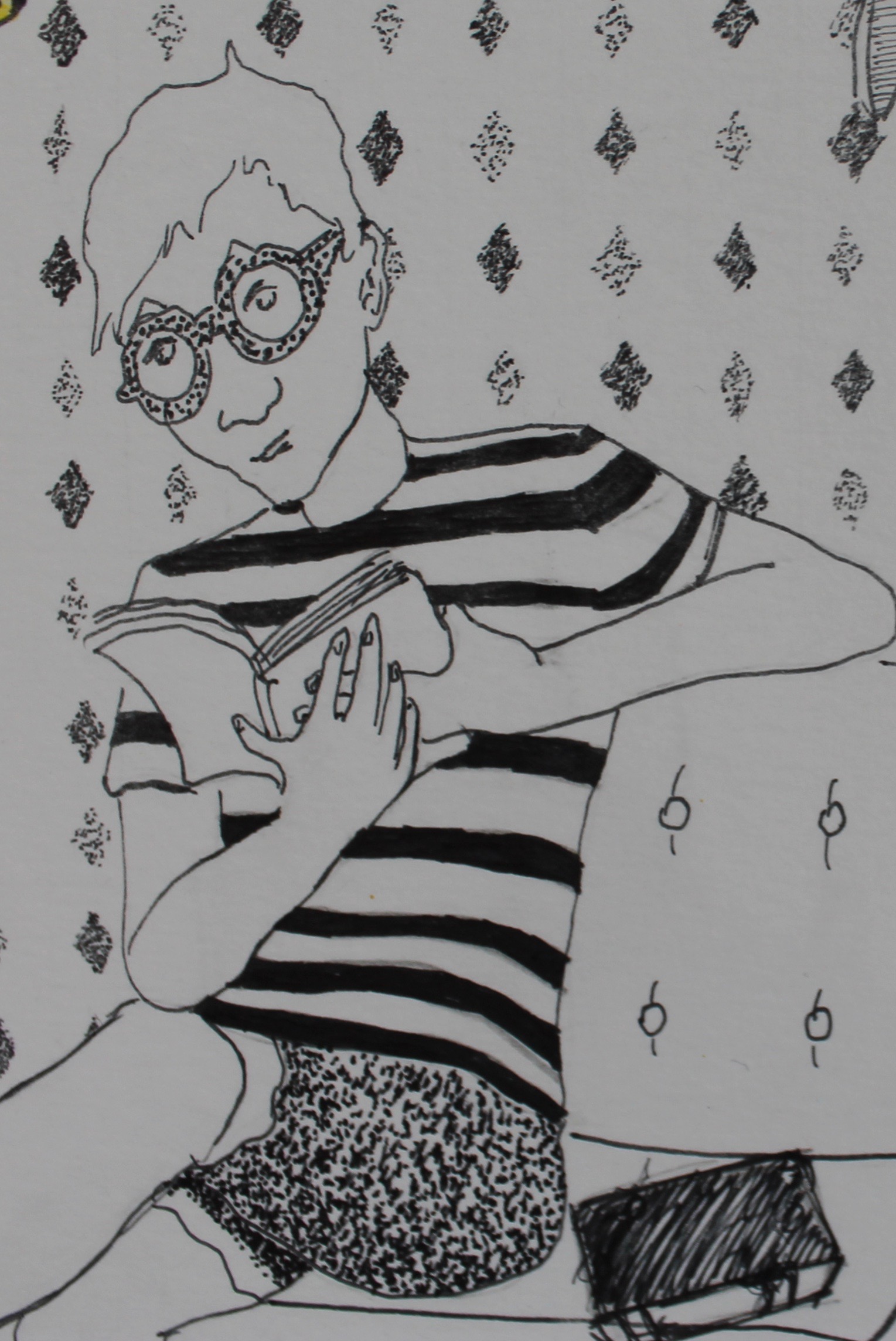
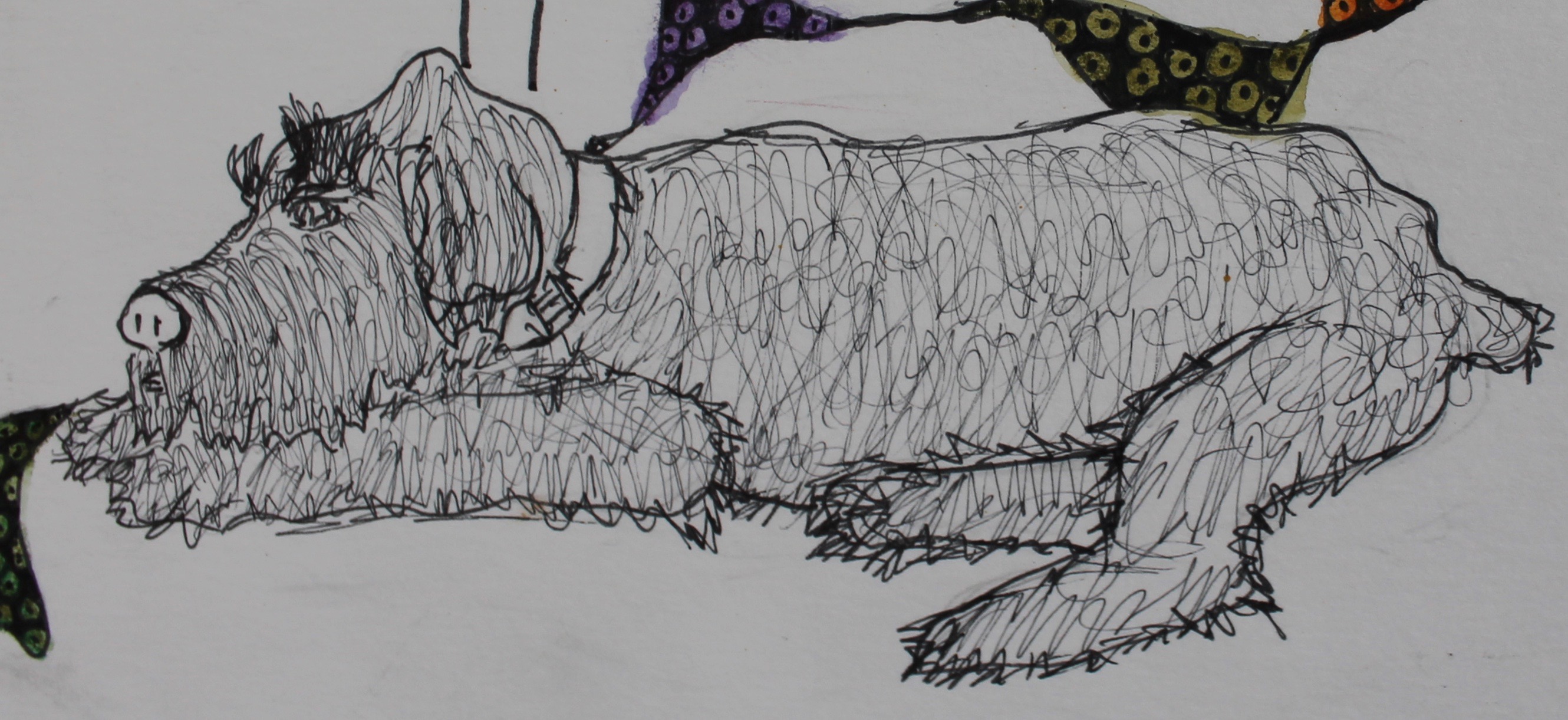
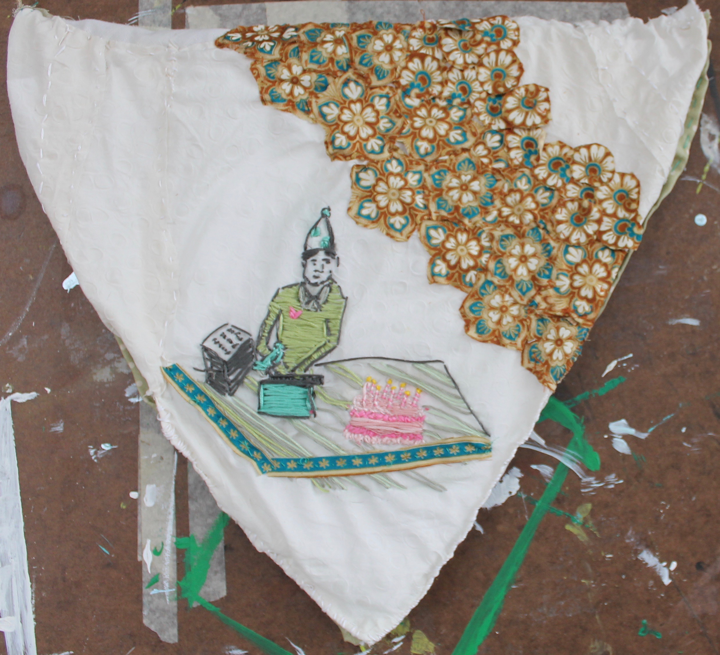
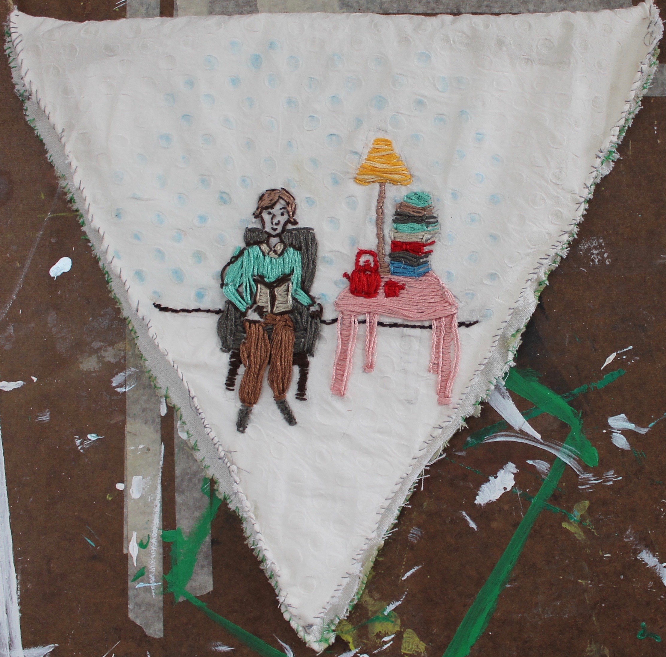
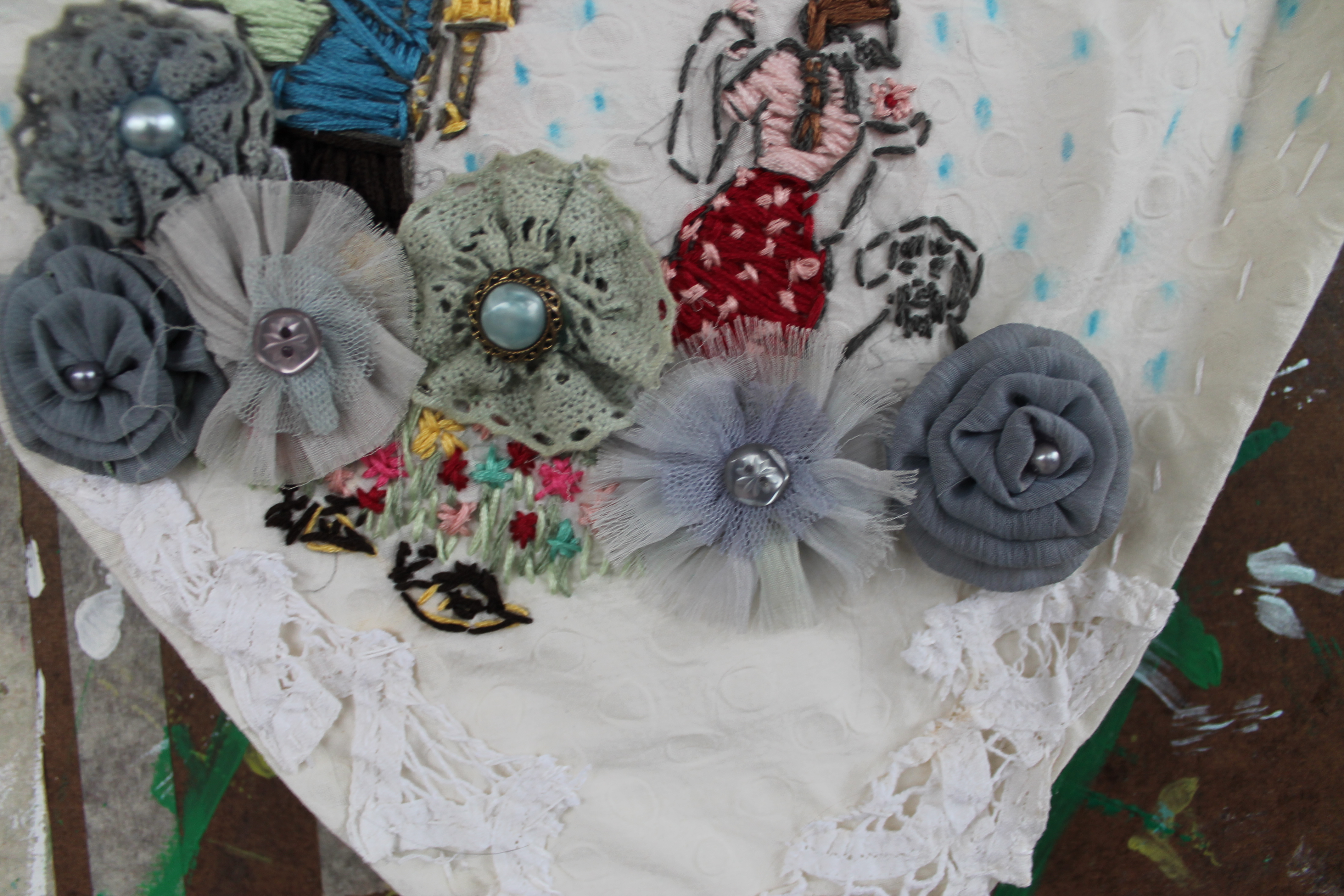
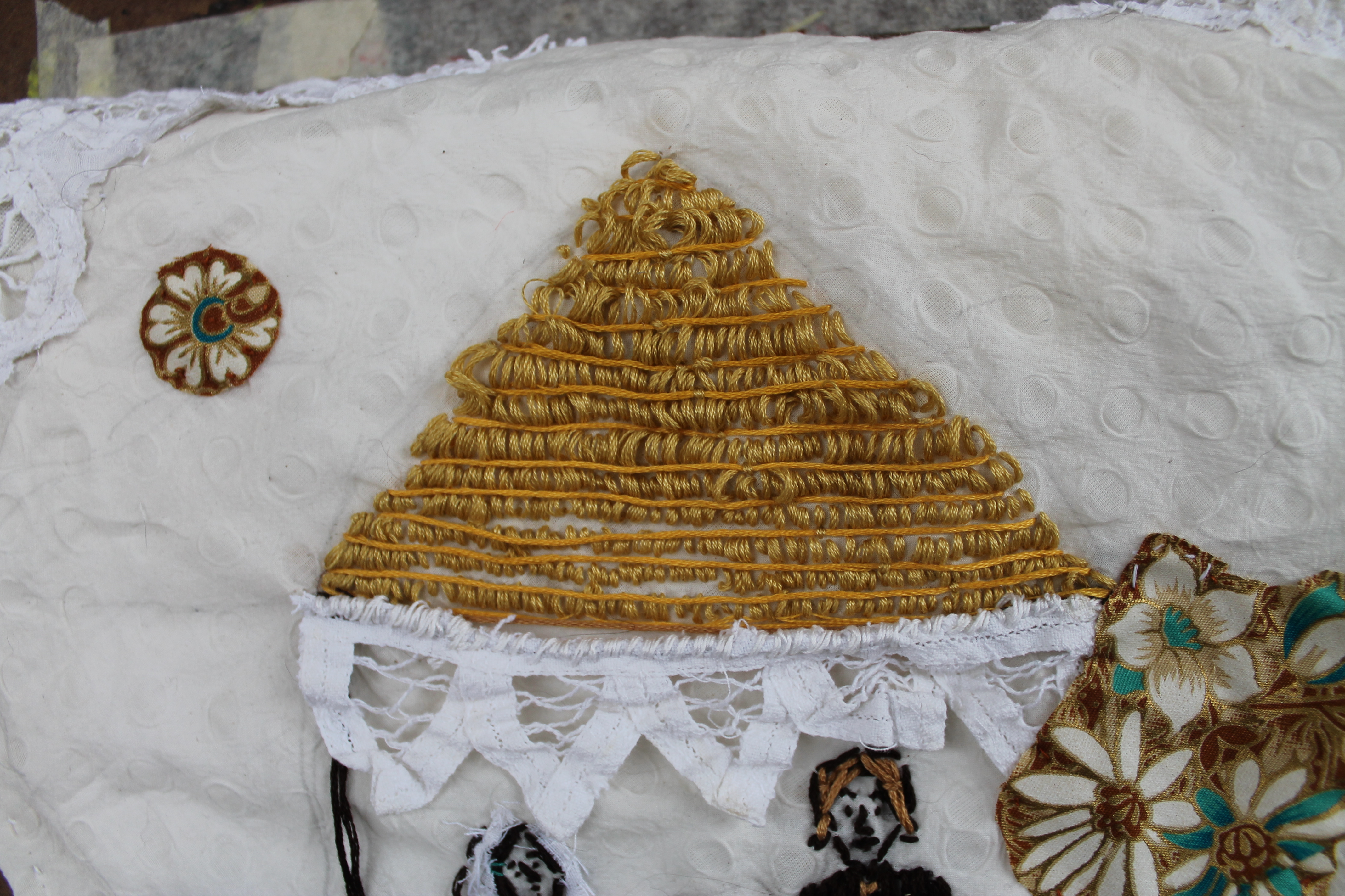
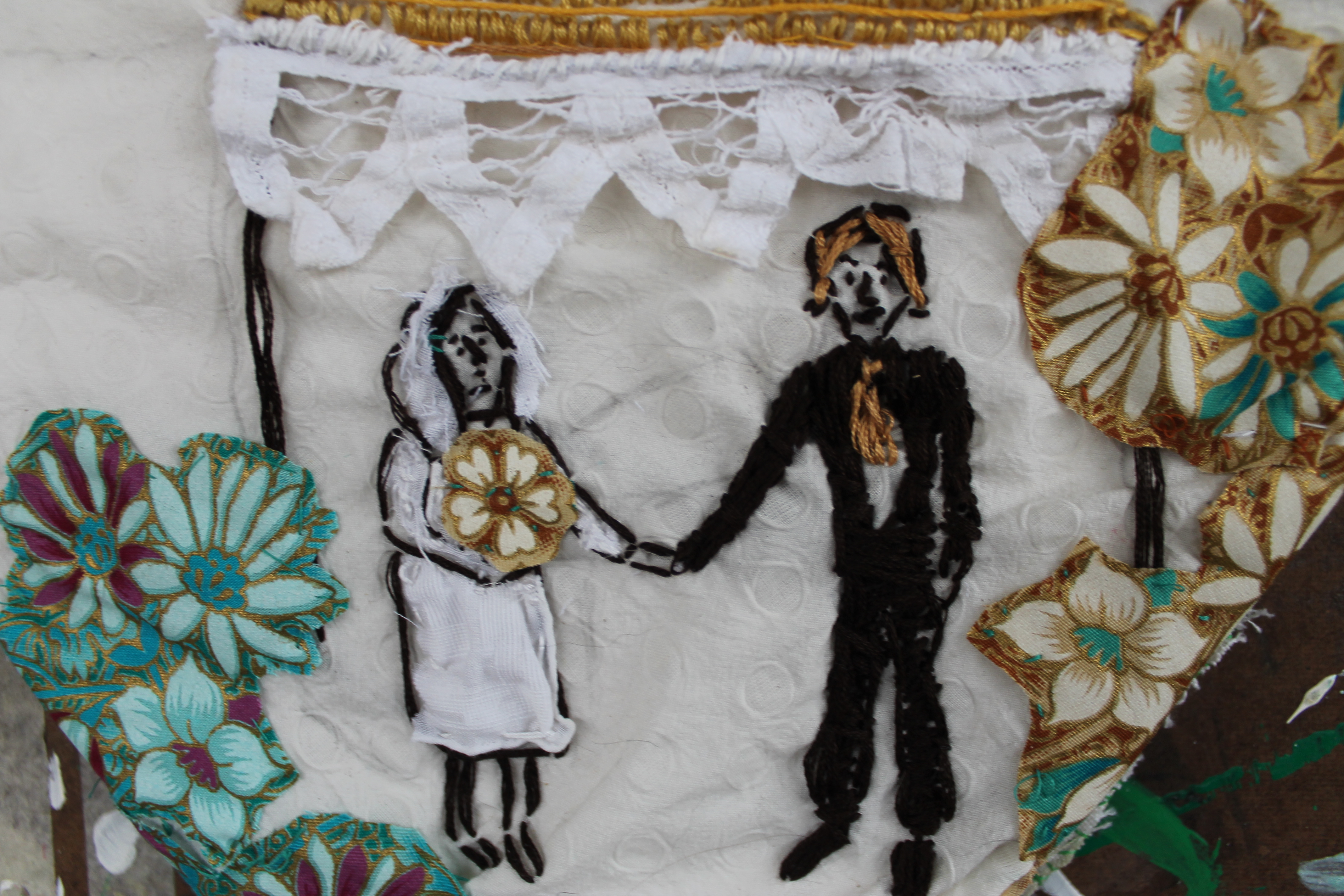
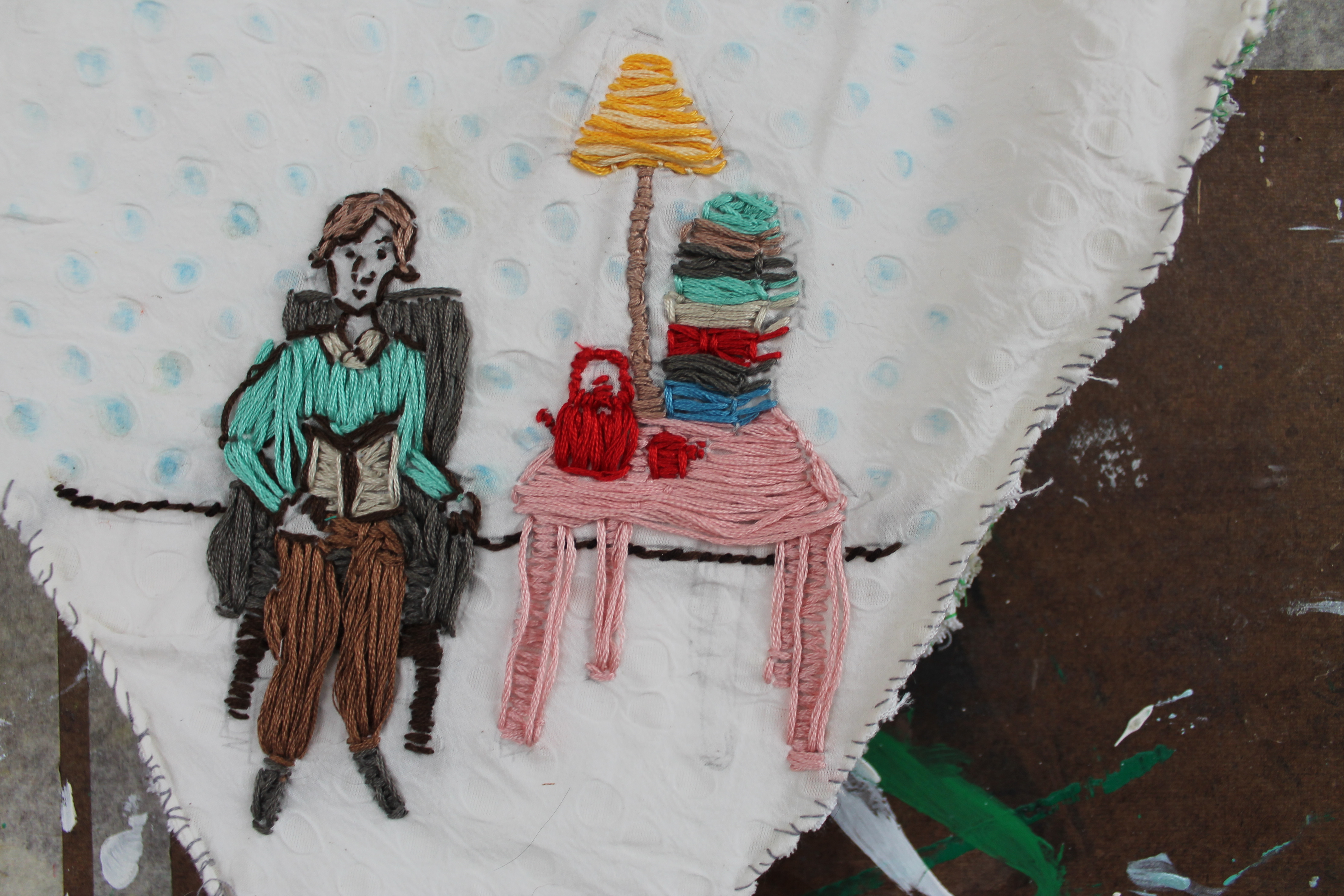
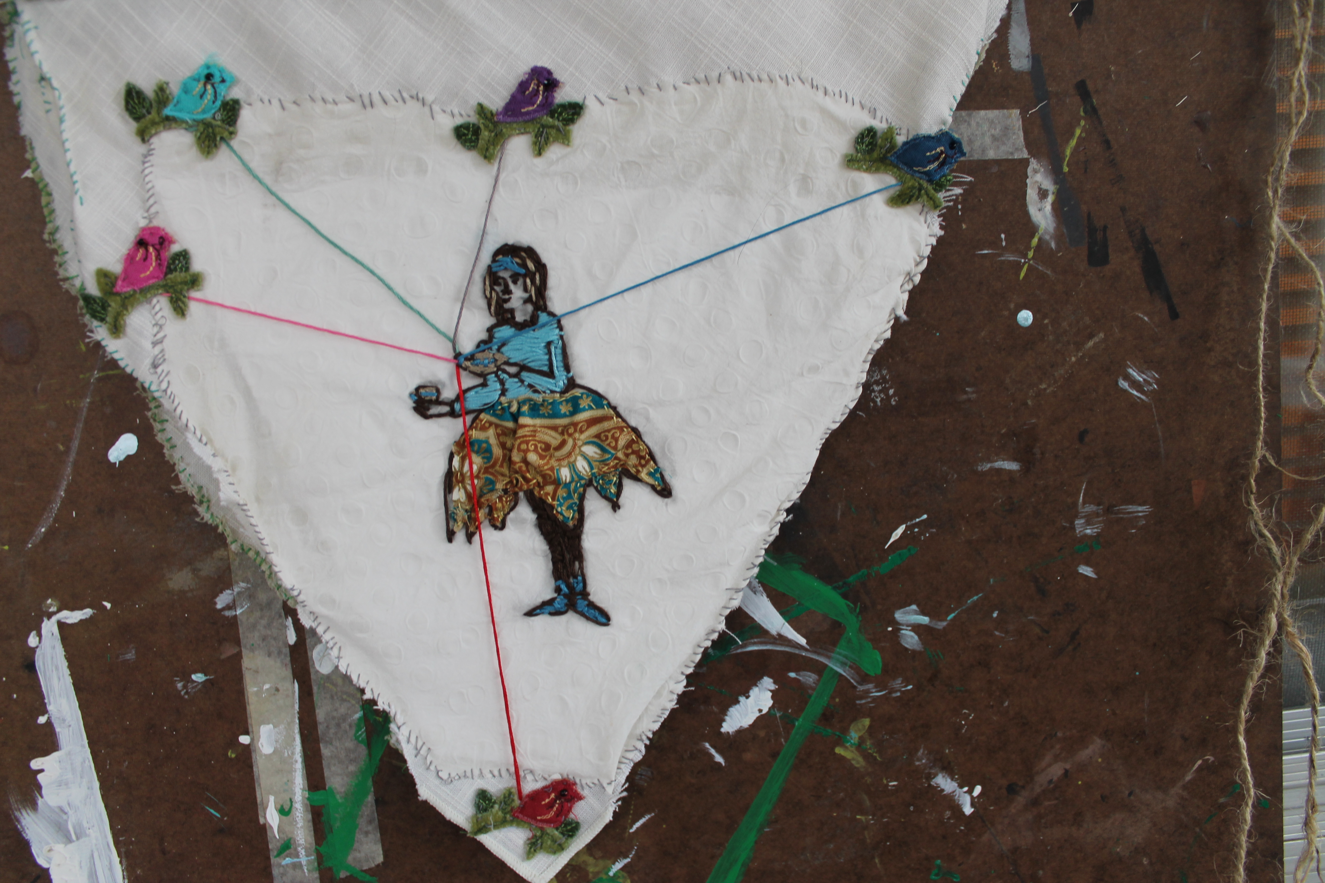
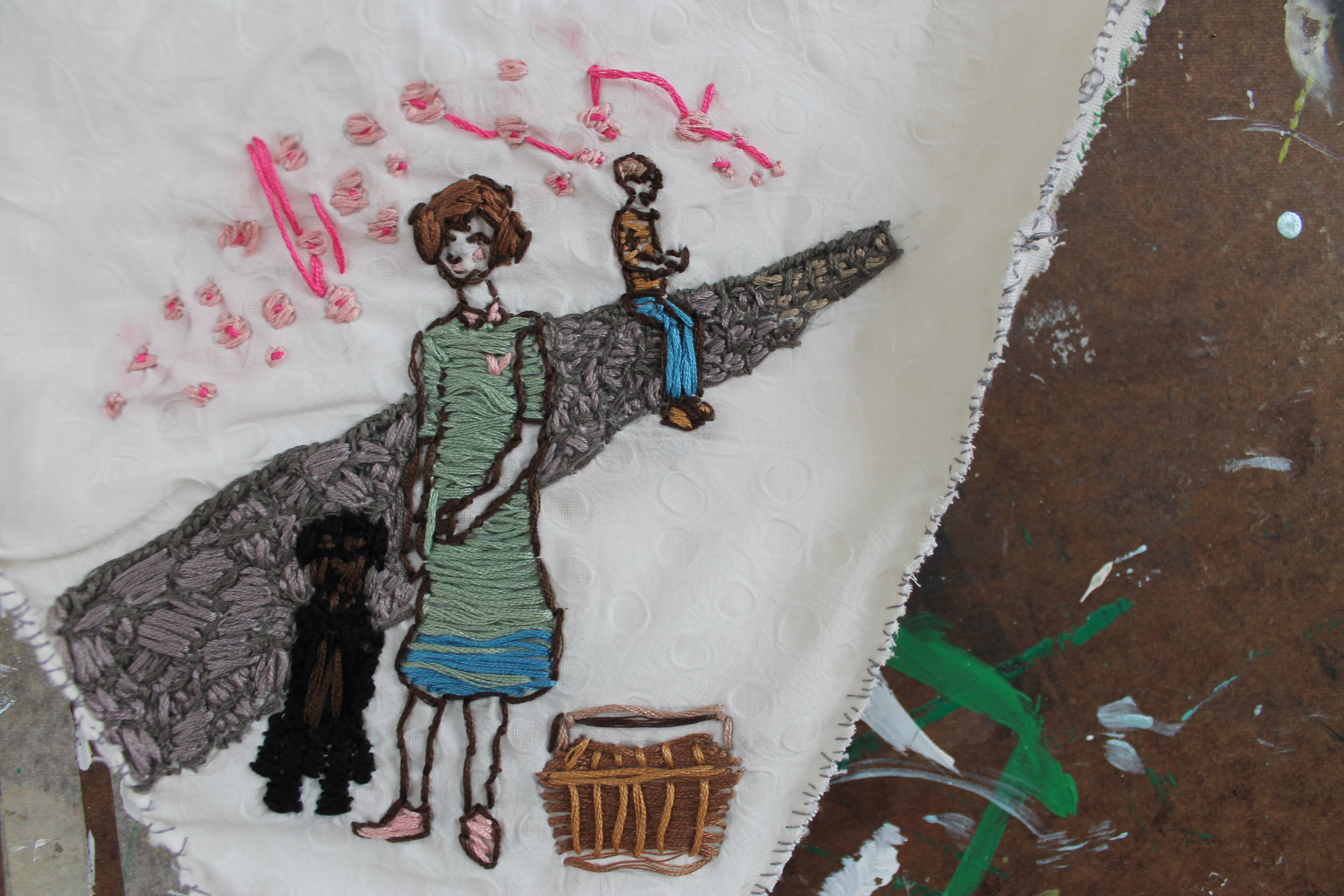
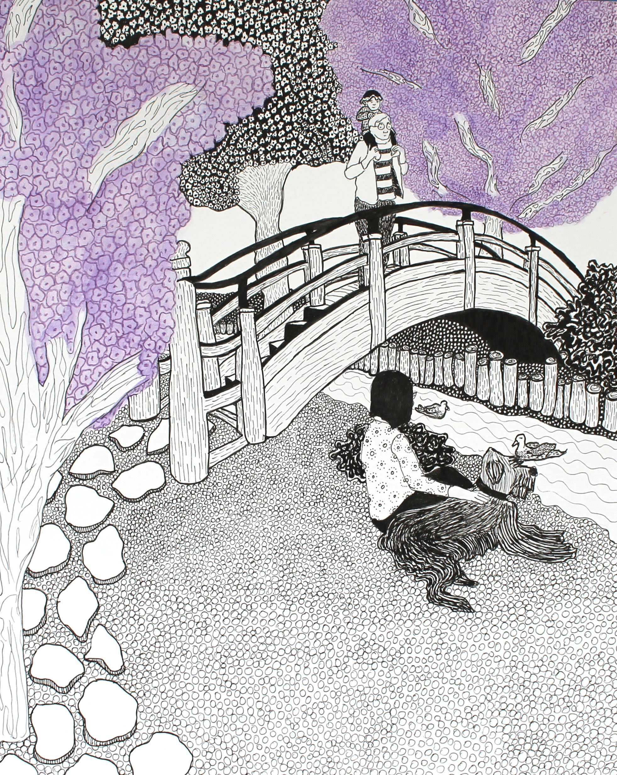
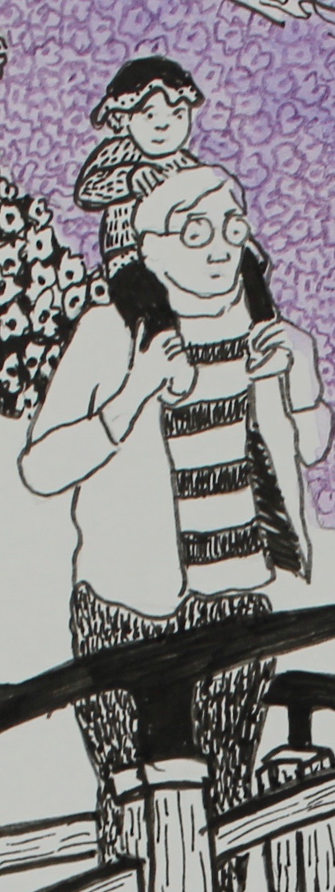
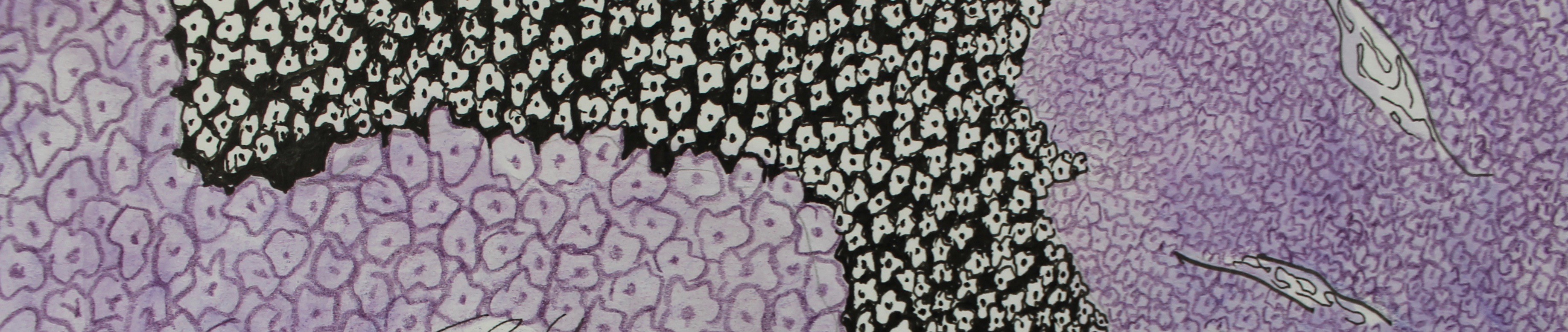
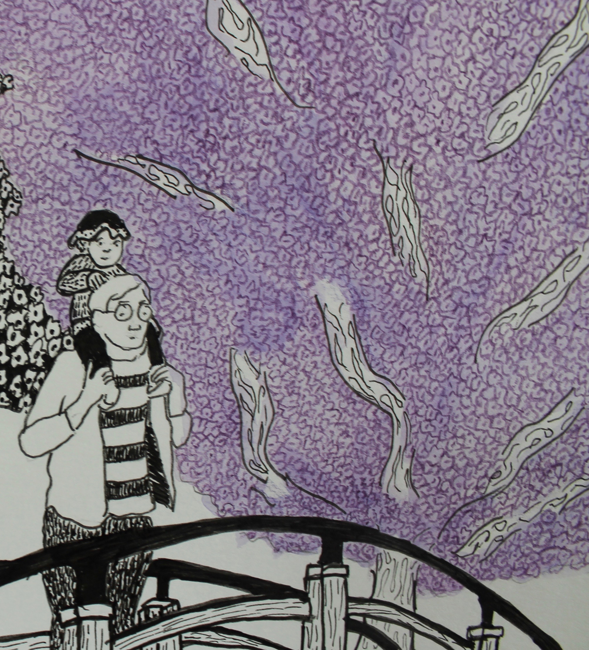
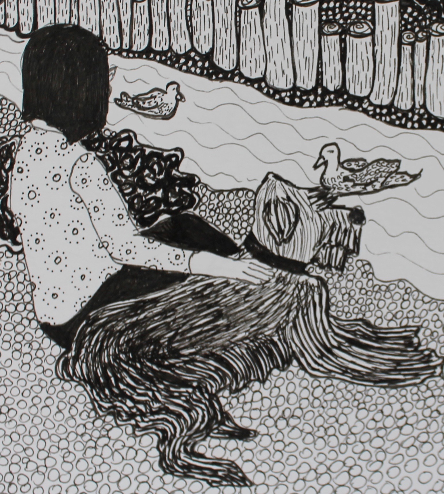
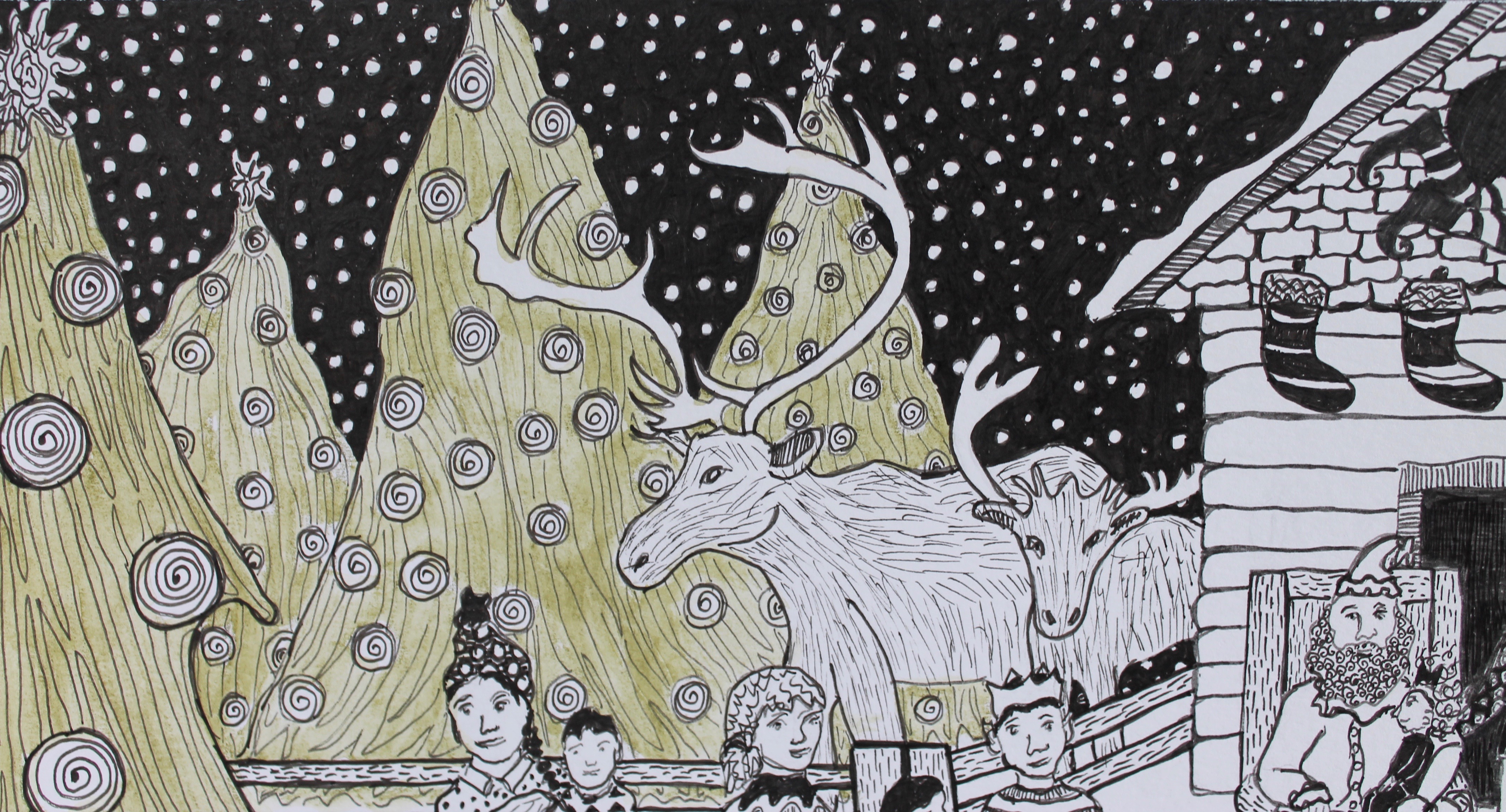
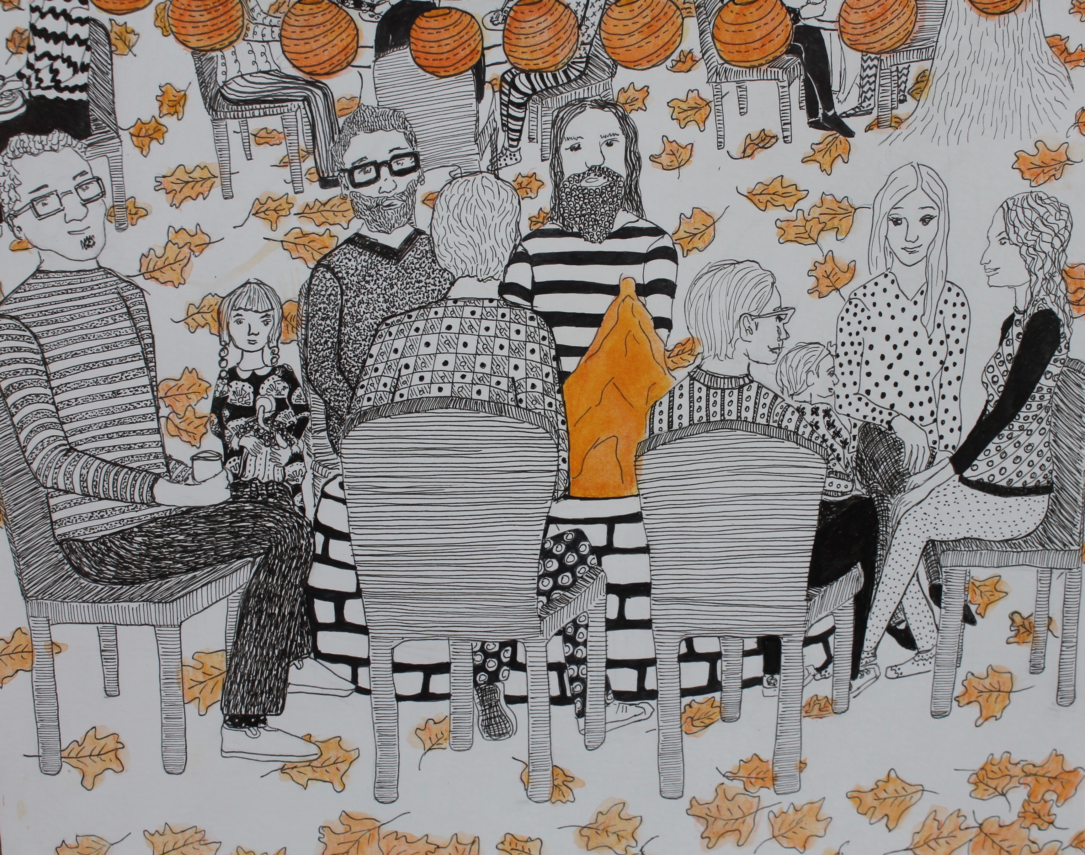
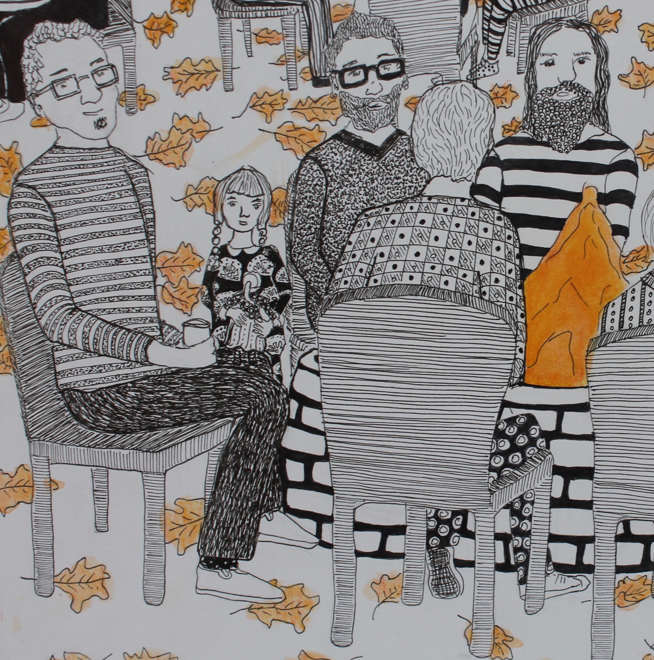
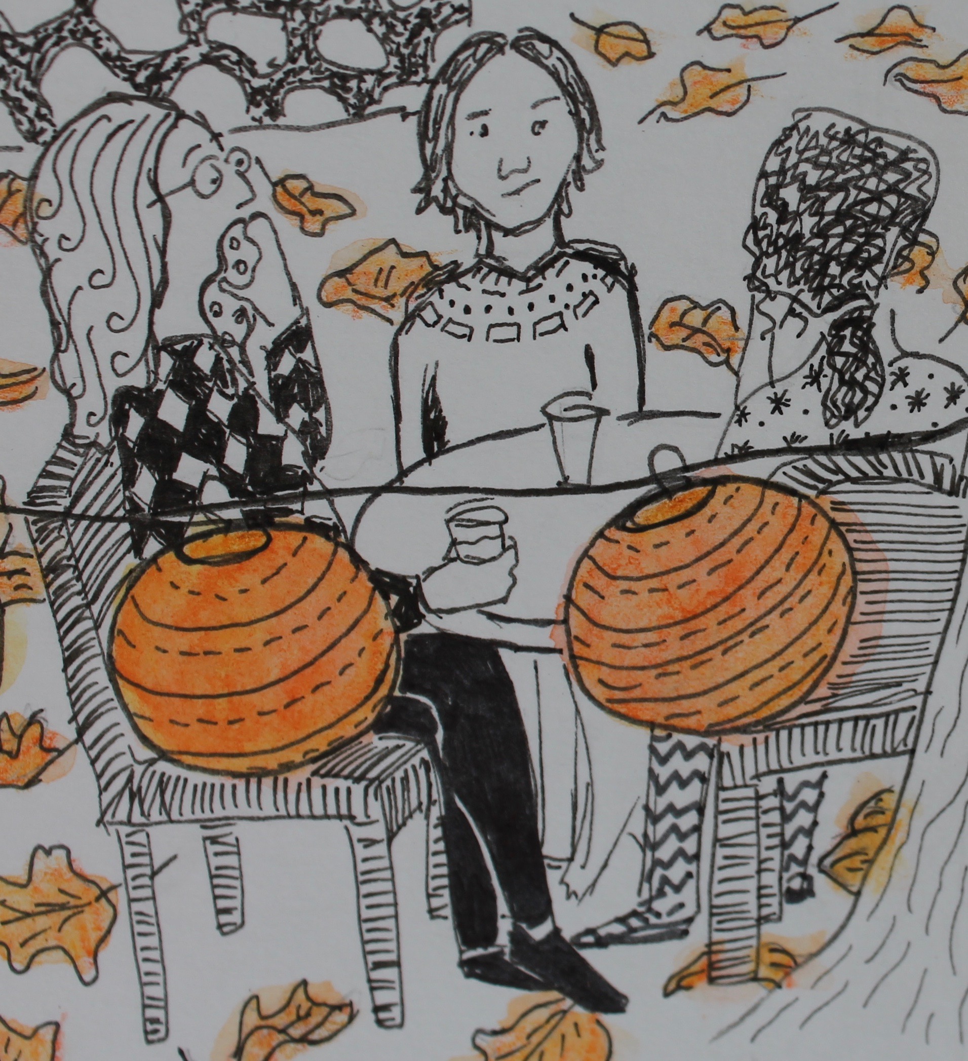
There is always an array of eclectic art by local artists on display. I asked if I could show some work, and after sending the usual website/portfolio/resume, I was invited to show for the month of June. I recently completed a series called “15 Illustrations,” which I have now renamed “Family Life Illustrations” and that is what I wanted to use for this show at Tea Bar and Bites.

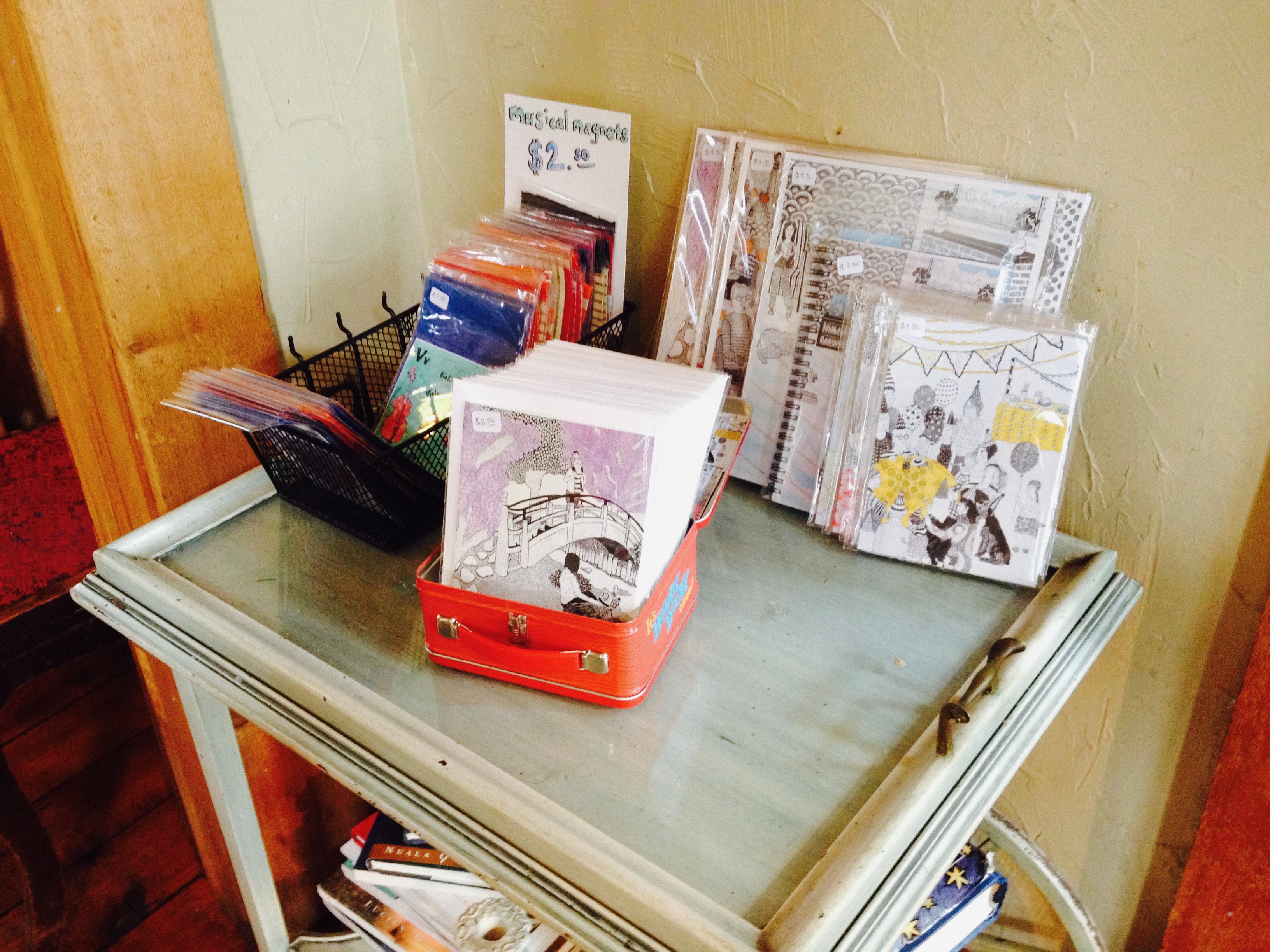
I went and photographed and measured the space months before the show. The space is limited, so I had to make a decision. Either I could hang about 10 of the pieces or I could make small art prints and hang all of the work. I decided to go with the latter decision because I think not only should the entire series be displayed together, but by putting up the smaller prints I could charge way less – should anyone want to leave with some of my art. I also created some cards, art prints, and musical magnets to sell.

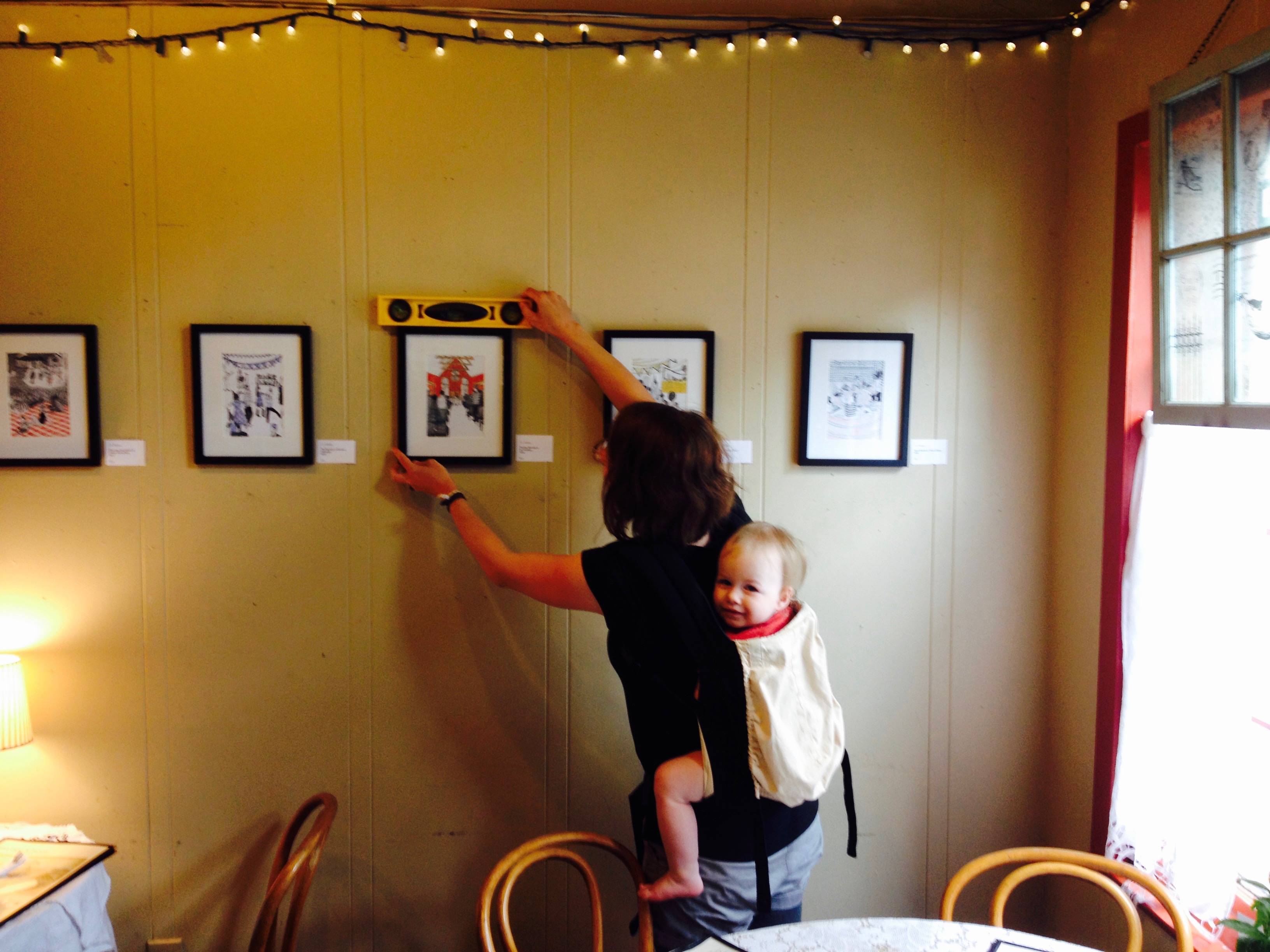
I ended up taking my kid with me to hang the show, so I wasn’t sure how that would go, but it ended up working out! Tea Bar and Bites gave me a cup of tea “on the house” – a Georgia Peach – while I set up the show.

I had three walls to work with. I set up the pieces first to see where everything should go.


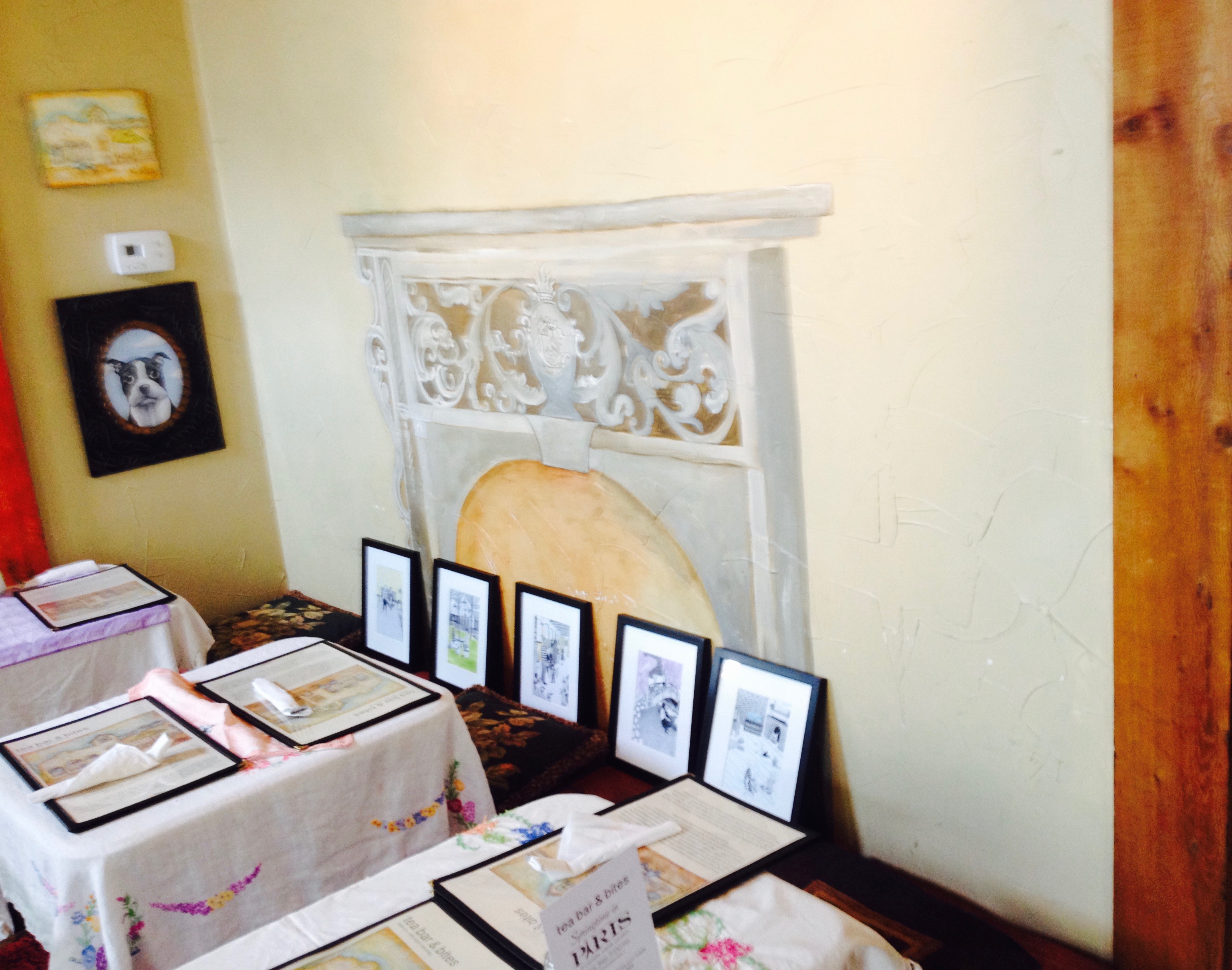
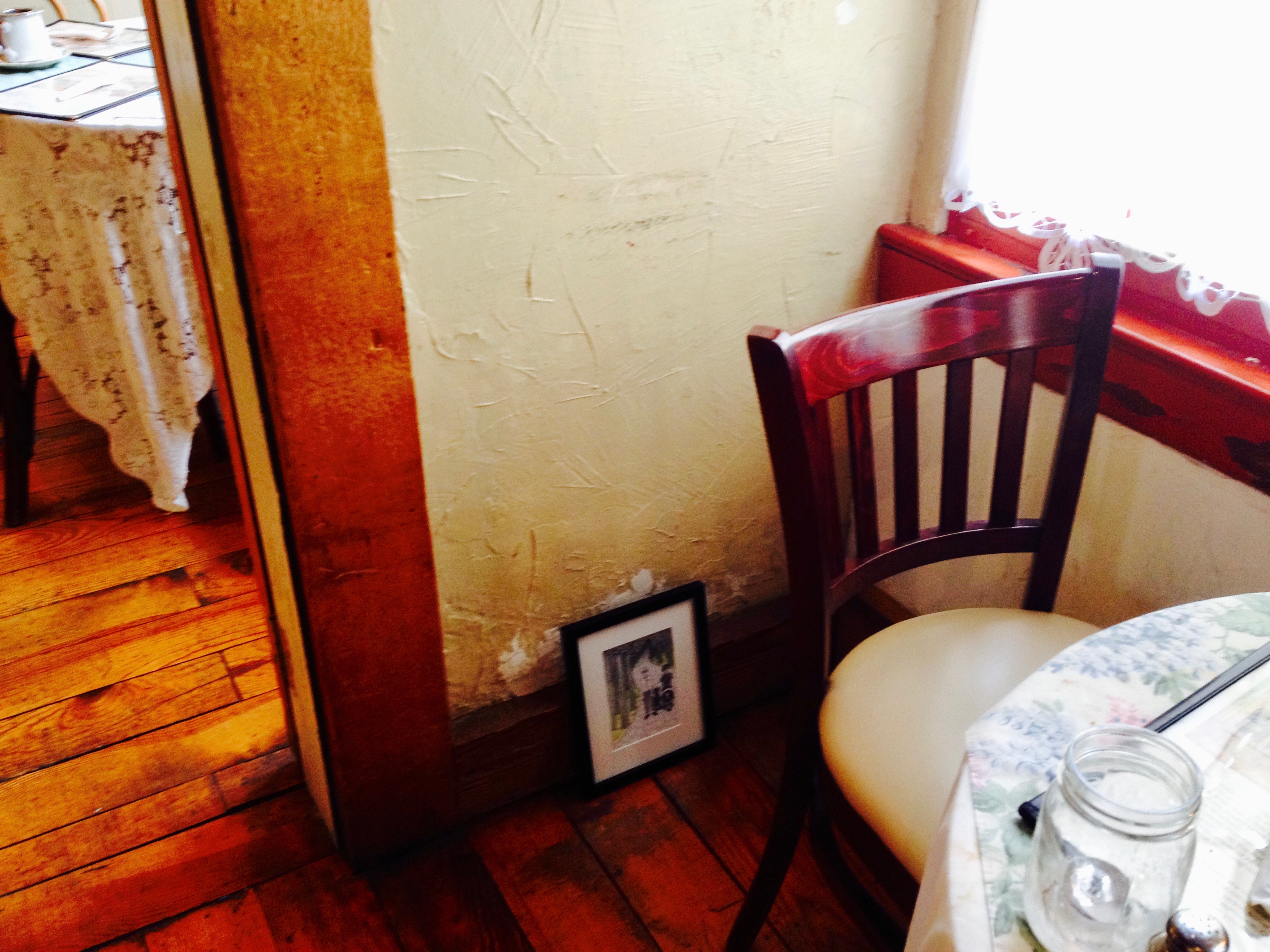
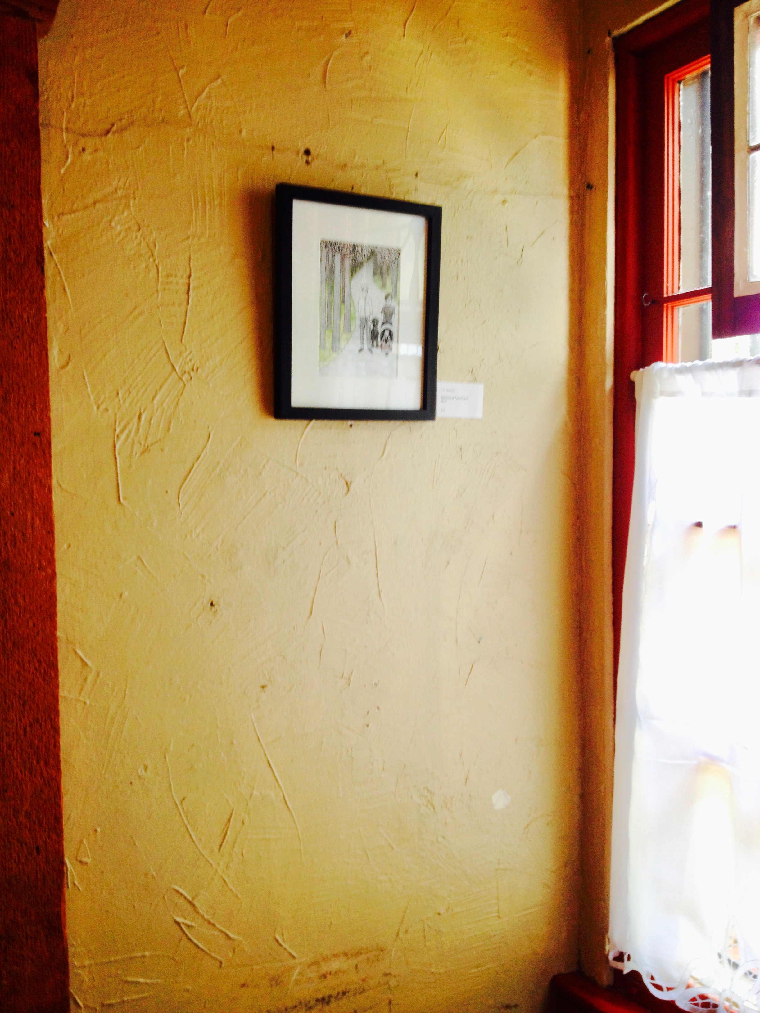
Once I set up the pieces, I realized that one of the plaster walls wouldn’t take any more holes, so I had to improvise and ended up using extra spaces I found.


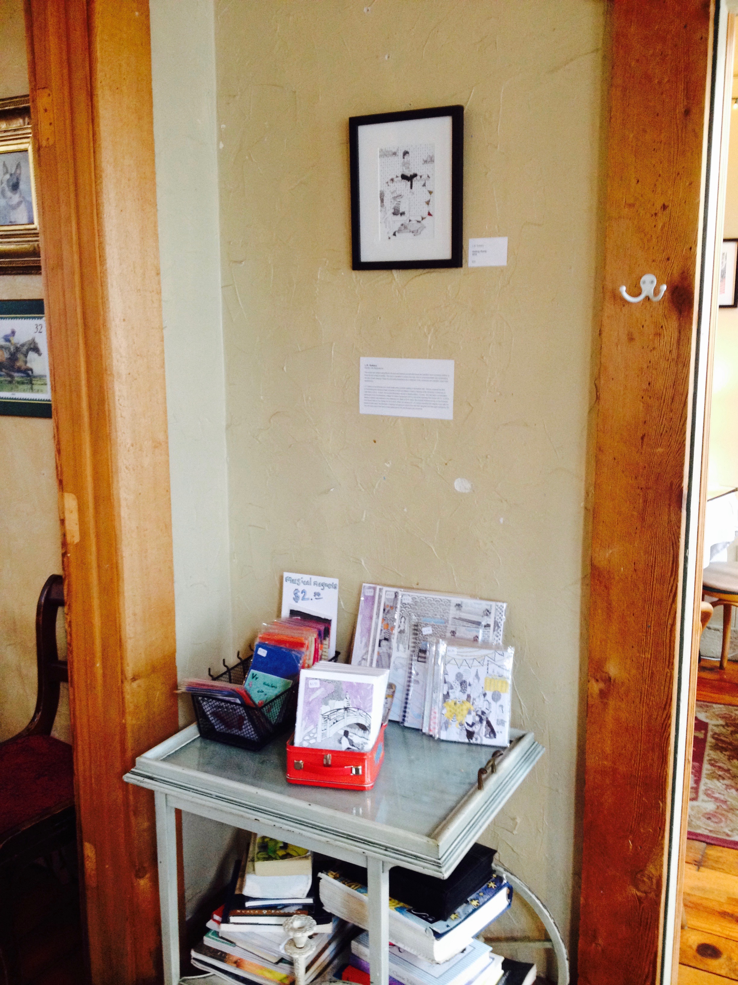
They even gave me a little cart to set up my extra fun stuff for sell.

This show is up for the month of June. The reception is Thursday, June 15th at 5 to 7 and The Damsels in Distress will be performing.


15 Illustrations: Getting Ready

I am working with Inktense pencils, Micron ink pens, and Canson Illustration 11×14″ 150lb art pad to create 15 illustrations (that is how many pieces of paper are in the art pad) of my current family life and inspirations.


This work is narrative in content and uses color in a monochromatic way accentuating one part of each drawing. These fun and quirky illustrations are a reflection of the current joy and activities I have been experiencing.

“Getting Ready” is the first and last drawing in the series. I drew it at the beginning of the series and it’s a bit of a “nesting” time before E was born. I wanted to discover during this series how our lives would change socially and in our community once we had a baby. After finishing the drawing, I decided to color each pendant from each of the drawings in the series (which made this drawing technically the last one completed). The colors would eventually represent all of our adventures together, but in the drawing it would just be my daydream.

Before, with no color

The colors used are Inktense pencils: Sun Yellow, Leaf Green and Teal Green blended, Carmine Pink and Tangerine blended, Carmine Pink, Spring Green, Fuchsia, Iris Blue and Mauve blended, Mustard, Saddle Brown, Poppy Red, Cadmium Orange and Tangerine blended, Leaf Green, and Mauve and Violet blended.

My favorite things about this drawing are the crayon books and snail bookends,


the new mom, dad, and dog sister waiting for baby,


the embroidery and flowers.

and the completed embroidery.


15 Illustrations: Exploring the Japanese Stroll Garden

I am working with Inktense pencils, Micron ink pens, and Canson Illustration 11×14″ 150lb art pad to create 15 illustrations (that is how many pieces of paper are in the art pad) of my current family life and inspirations.


This work is narrative in content and uses color in a monochromatic way accentuating one part of each drawing. These fun and quirky illustrations are a reflection of the current joy and activities I have been experiencing.

“Exploring the Japanese Stroll Garden” is just one of many times we have been to the Mizumoto Japanese Stroll Garden in Springfield, MO. We all love to walk around and explore what the different seasons have to offer in the garden. It is such a relaxing and calm place to be. I used Inktense pencils Mauve and Violet blended for the purple blooming trees.

My favorite things about this drawing are the bridge and Micah and E looking off of the bridge,

all of the nature textures – the pebbled ground, trees, and bushes,


the rock pathway and log edging along the water,

and Ein and I watching the ducks.

Inspiration for this drawing


15 Illustrations: Christmas at Bass Pro

I am working with Inktense pencils, Micron ink pens, and Canson Illustration 11×14″ 150lb art pad to create 15 illustrations (that is how many pieces of paper are in the art pad) of my current family life and inspirations.


This work is narrative in content and uses color in a monochromatic way accentuating one part of each drawing. These fun and quirky illustrations are a reflection of the current joy and activities I have been experiencing.

“Christmas at Bass Pro” was a memorable time to say the least. It was E’s first carousel ride, first time meeting Santa (which seemed to be more of a traumatic experience than of joy), and first time watching an automatic train set. There was also a very large Christmas tree, which is featured in the drawing and inspired the use of Inktense pencil Leaf Green for the color.

My favorite things about this drawing are the “Santa’s elf” photographer, Santa’s little log cabin set up, and my friend Stashia and her daughter Avi meeting Santa,

the line of families to meet Santa, our family portrait, and our fun patterned pants (I wish we had this many patterned clothes in our real wardrobe),

all of the over-the-top Christmas decorations, the presents under the tree (with the fun wrapping paper patterns), the Christmas trees, and it wouldn’t be a Bass Pro Christmas celebration without the taxidermy reindeer ya’ll.


Inspiration for this drawing

15 Illustrations: Bonfire at Sequiota Bike Shop

I am working with Inktense pencils, Micron ink pens, and Canson Illustration 11×14″ 150lb art pad to create 15 illustrations (that is how many pieces of paper are in the art pad) of my current family life and inspirations.


This work is narrative in content and uses color in a monochromatic way accentuating one part of each drawing. These fun and quirky illustrations are a reflection of the current joy and activities I have been experiencing.

“Bonfire at Sequiota Bike Shop” was a wonderful, cold Fall evening where we were able to sit around a bonfire with our friends at Sequiota Bike Shop and enjoy our time together. This event really stuck in my mind because although it was a “spur of the moment” get together, I just kept thinking about what a really great time we had. Our baby just sat in my lap and relaxed, which is always such a treat. The fire was huge and toasty, and I have enjoyed bonfires since childhood, so it was even a bit nostalgic. I used Inktense pencils Cadmium Orange and Tangerine blended.

My favorite things about this drawing are my group of friends,

guy talk and girl talk,

man portraits, the little girl with her baby doll (our friend’s daughter), and mom and daughter portrait,


the other people there,


the barn bar

the rock wall, the decorative lantern lights, and the fallen leaves.


Inspiration for this drawing