Mural Painting at the Vineyard Church

The Vineyard Church here in Springfield, MO wanted a mural for their children’s ministry, and I am always looking for ways to use my art as ministry since that is my gifting.

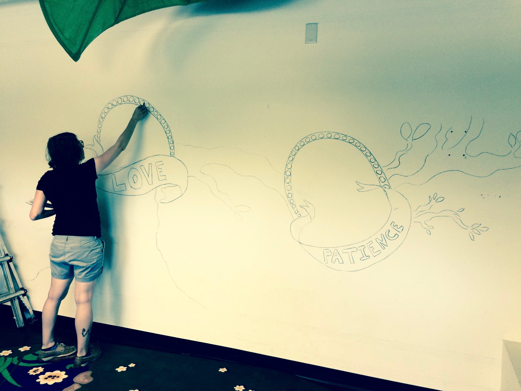
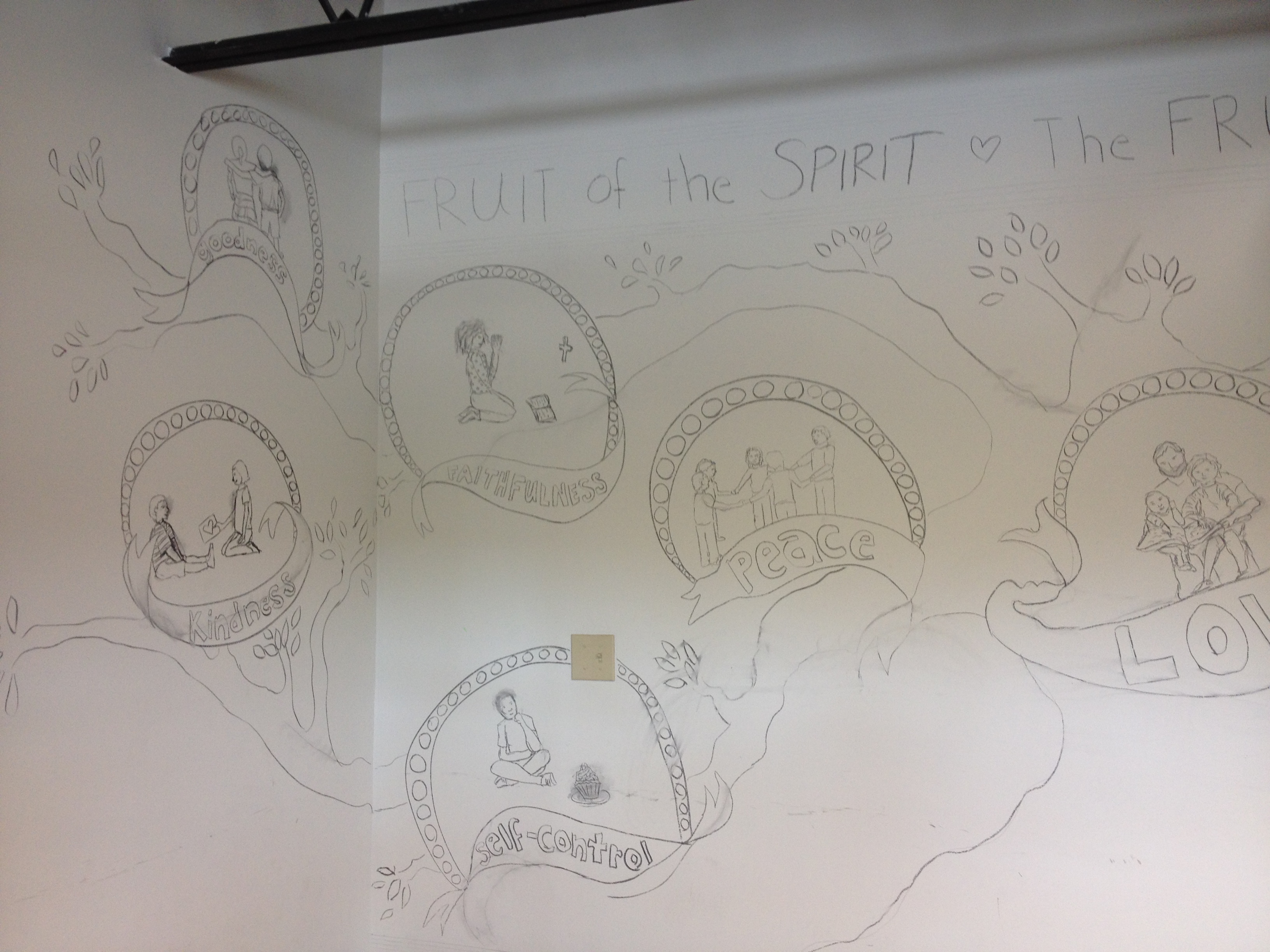
Josh, one of the pastors, wanted a tree with the fruit of the spirit. In the New Living Translation (NLT) Bible, Galatians 5:18-25 says “But when you are directed by the Spirit, you are not under obligation to the law of Moses. When you follow the desires of your sinful nature, the results are very clear: sexual immorality, impurity, lustful pleasures, idolatry, sorcery, hostility, quarreling, jealousy, outbursts of anger, selfish ambition, dissension, division, envy, drunkenness, wild parties, and other sins like these. Let me tell you again, as I have before, that anyone living that sort of life will not inherit the Kingdom of God. But the Holy Spirit produces this kind of fruit in our lives: love, joy, peace, patience, kindness, goodness, faithfulness, gentleness, and self-control. There is no law against these things! Those who belong to Christ Jesus have nailed the passions and desires of their sinful nature to his cross and crucified them there. Since we are living by the Spirit, let us follow the Spirit’s leading in every part of our lives.”

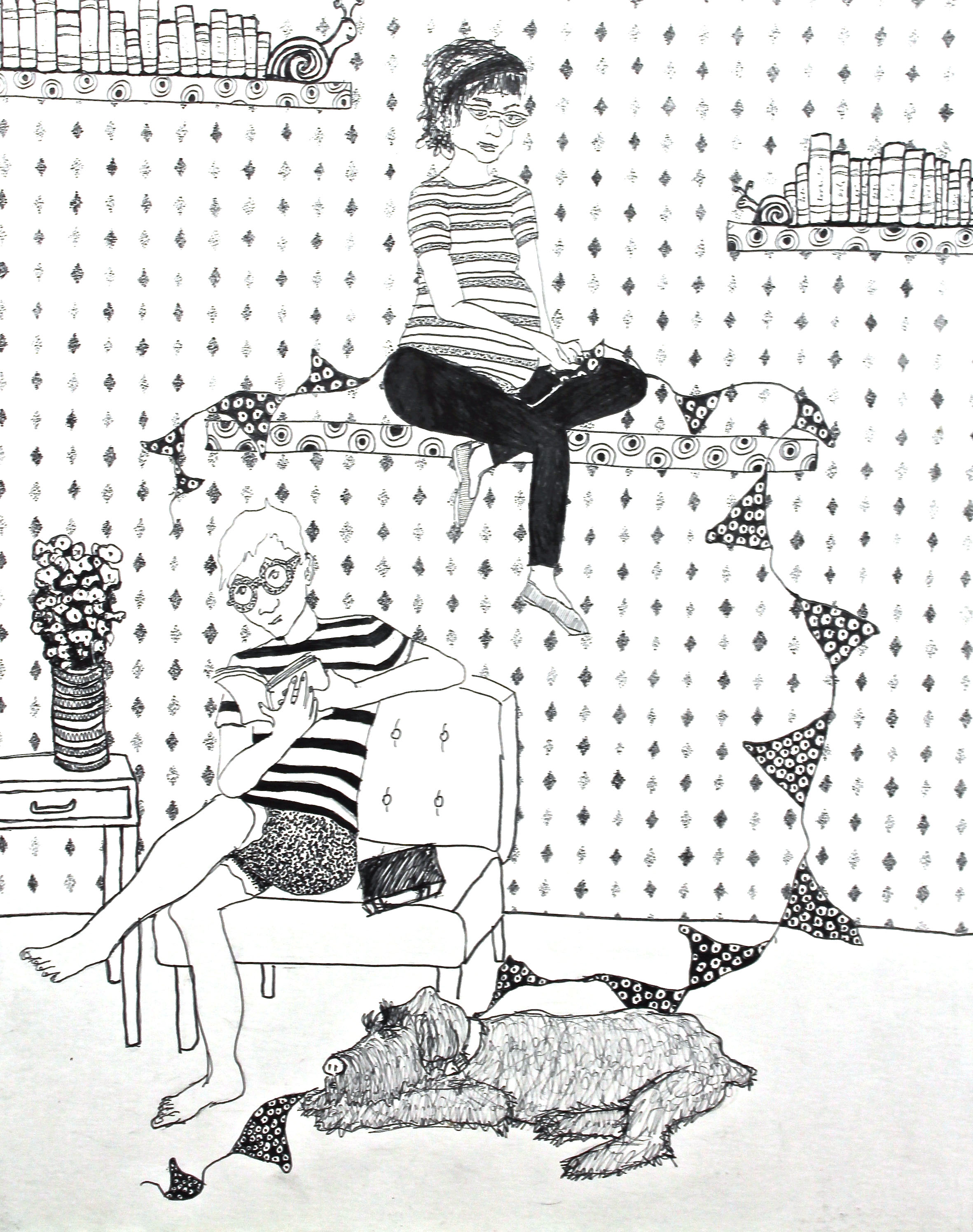
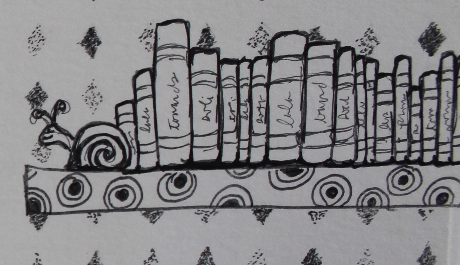
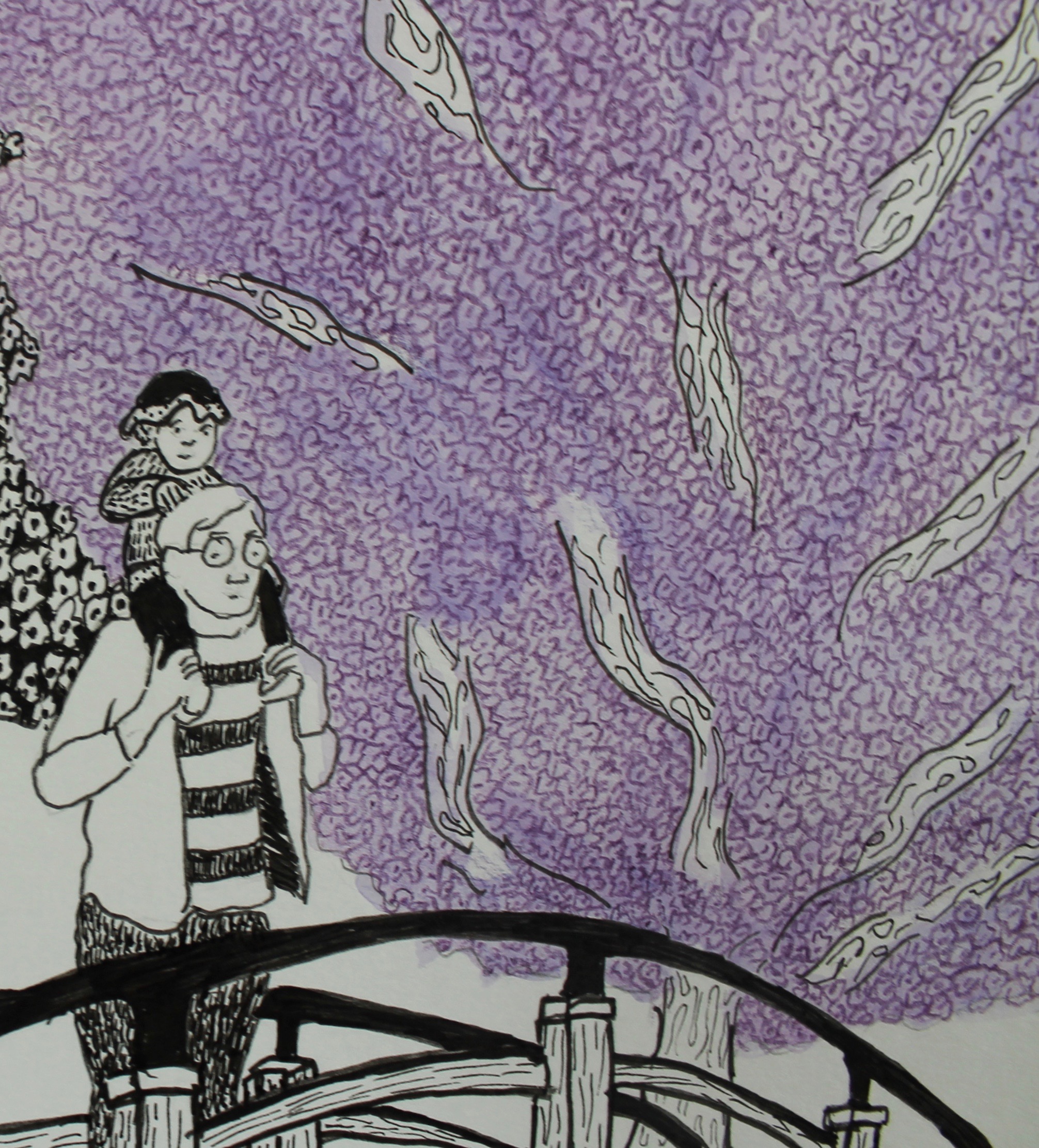
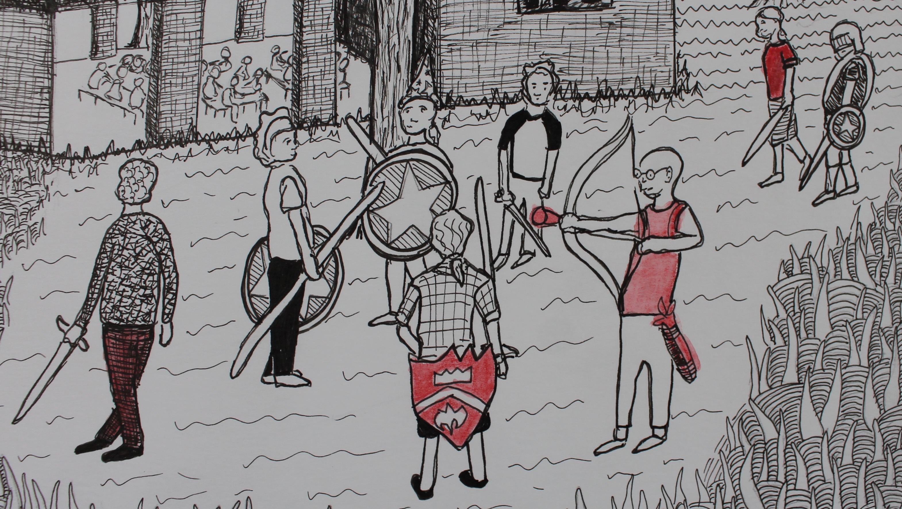
I was actually inspired from the Harry Potter movie series.

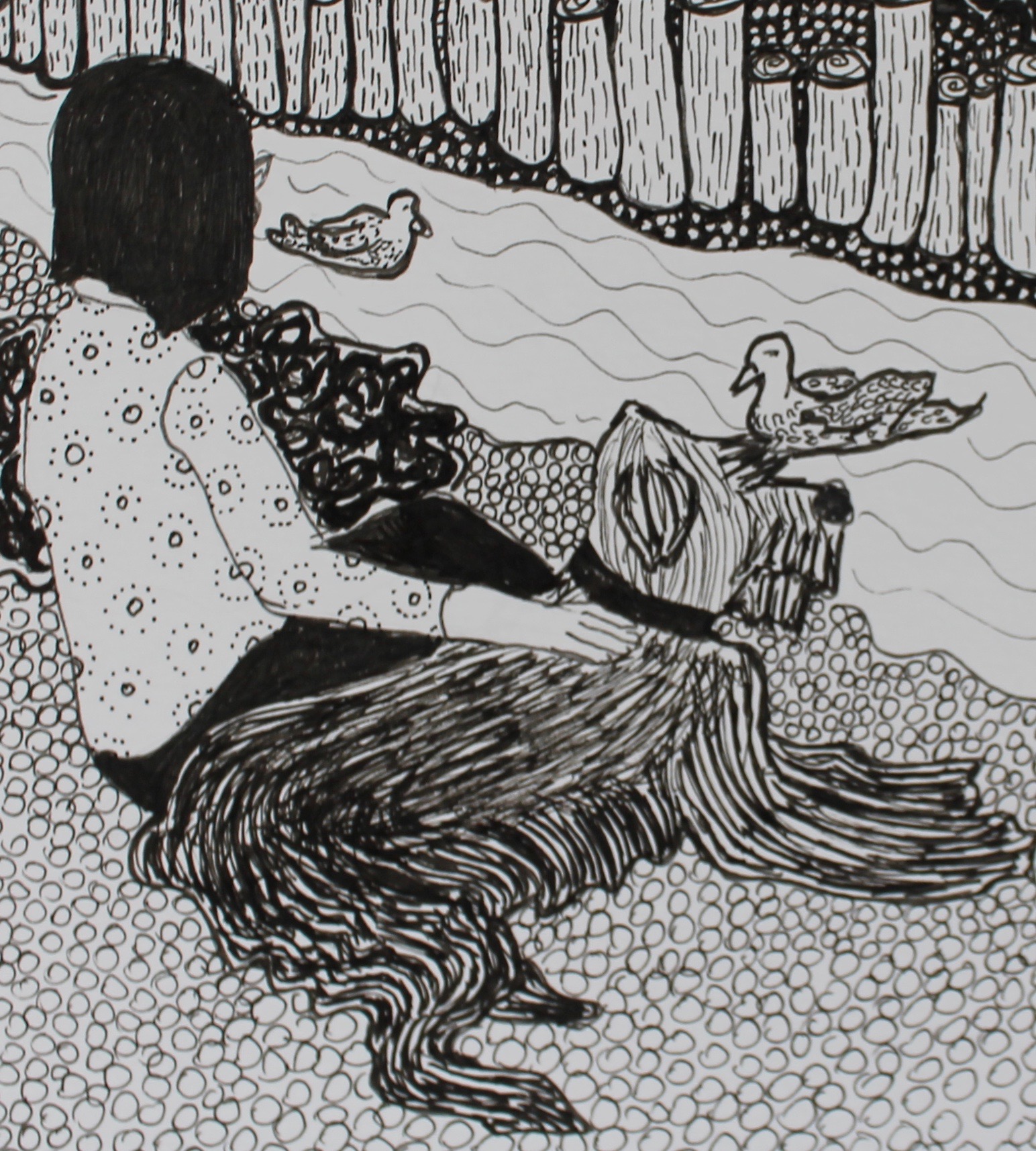
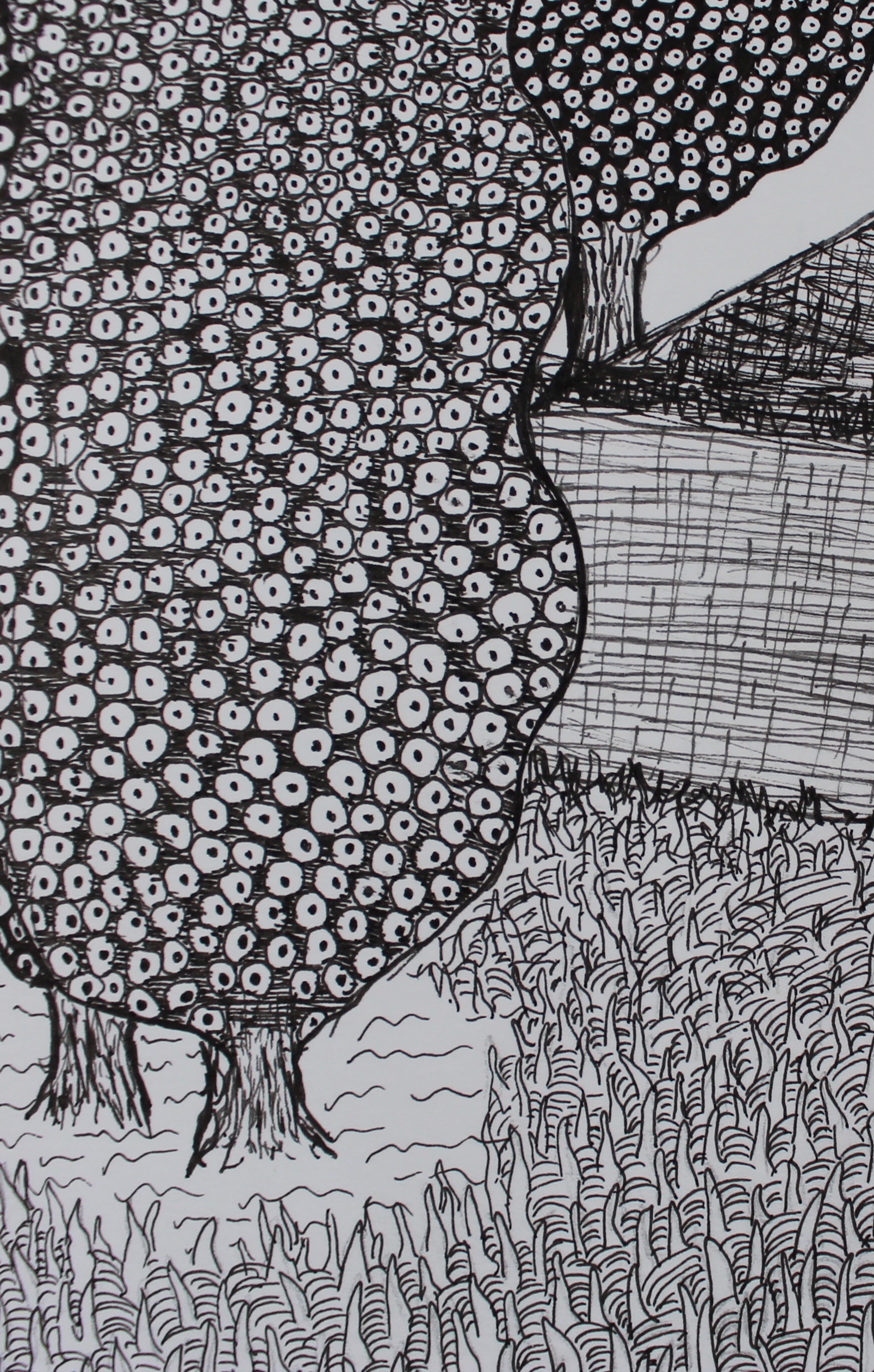
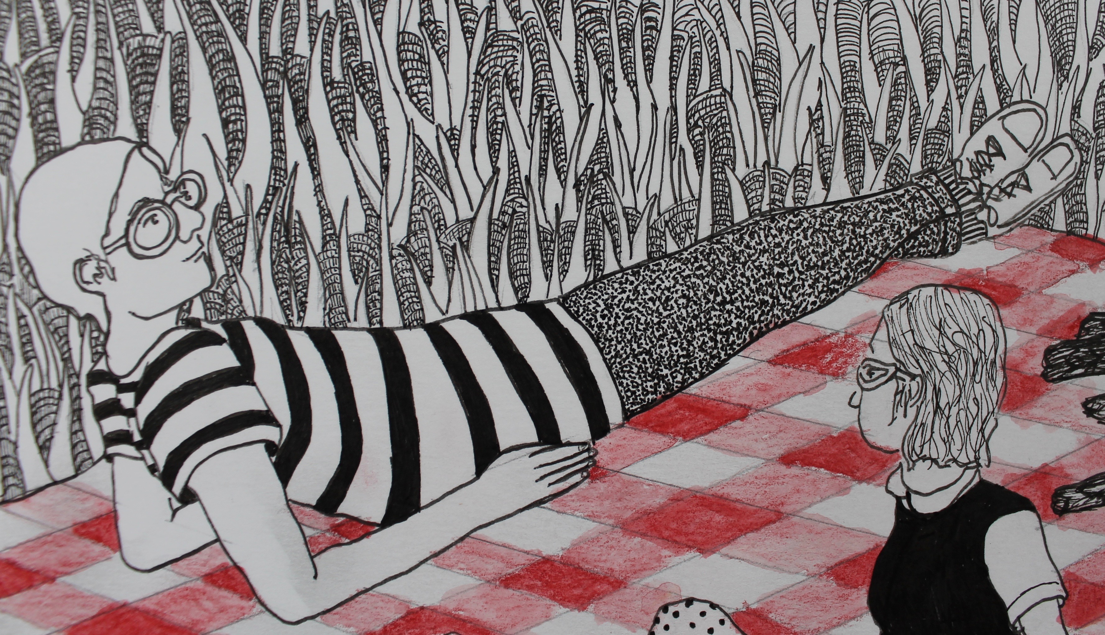
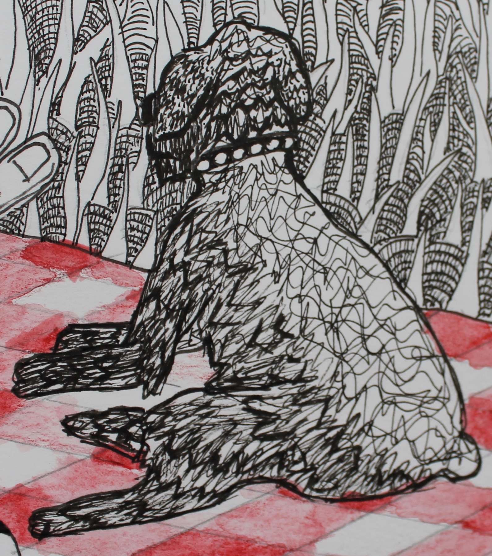
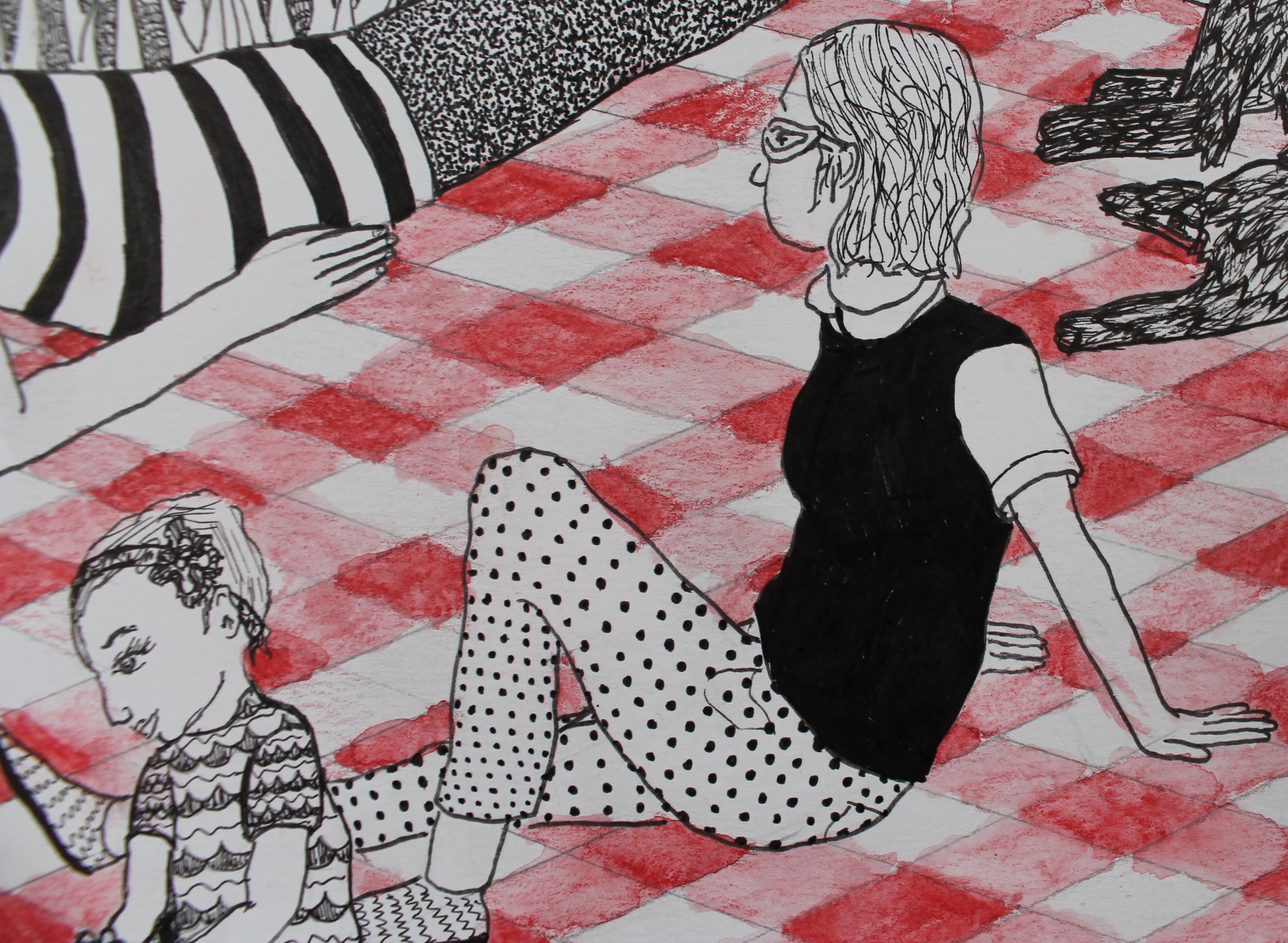
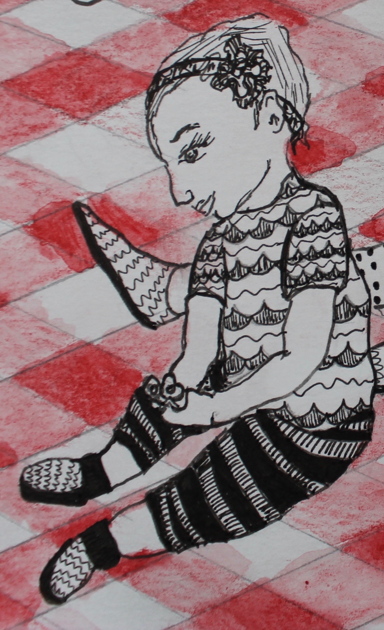
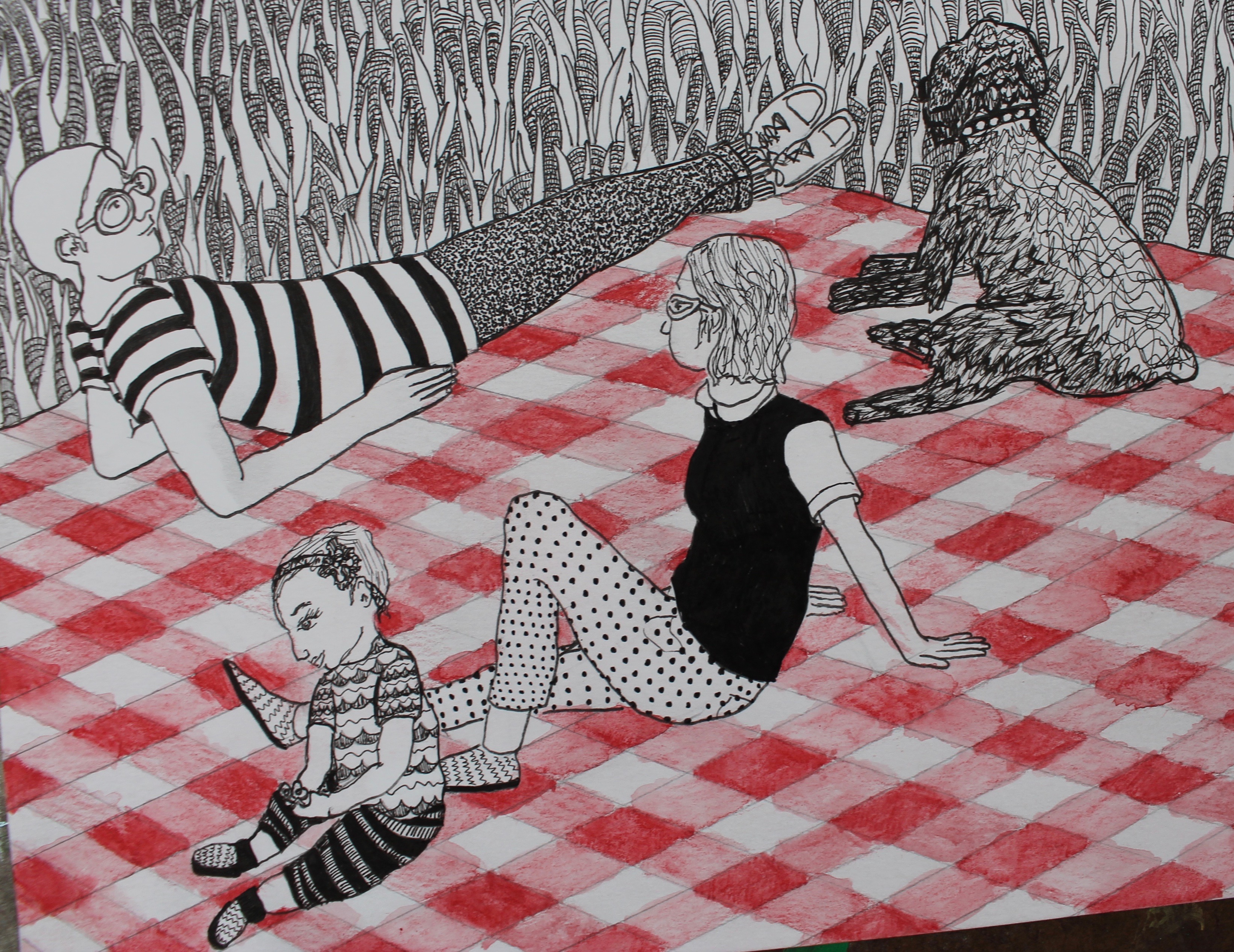
After looking at some pictures of the “Black Family Tree,” I sketched up this drawing.

I brought the mural painting supplies and kept them in a closet at the church while I worked. I used pencils, ruler, willow charcoal, eraser, paint brushes, Velspar house paint samples, acrylic paint (Winsor & Newton Galleria: Burnt Umber, Yellow Ochre, Mars Black, Cadmium Yellow Medium Hue, and Pale Umber. Golden: Cadmium Red Medium Hue and Burnt Sienna. Liquitex Basics: Raw Sienna. Liquitex: Raw Umber. Grumbacher Academy: Titanium White and Burnt Sienna), brushes, soap, latex gloves, paper towels, palette knife, plastic cups, baking pans, palette paper, painters, Masters Hand Soap, a tarp, ladder, and diaper bag.

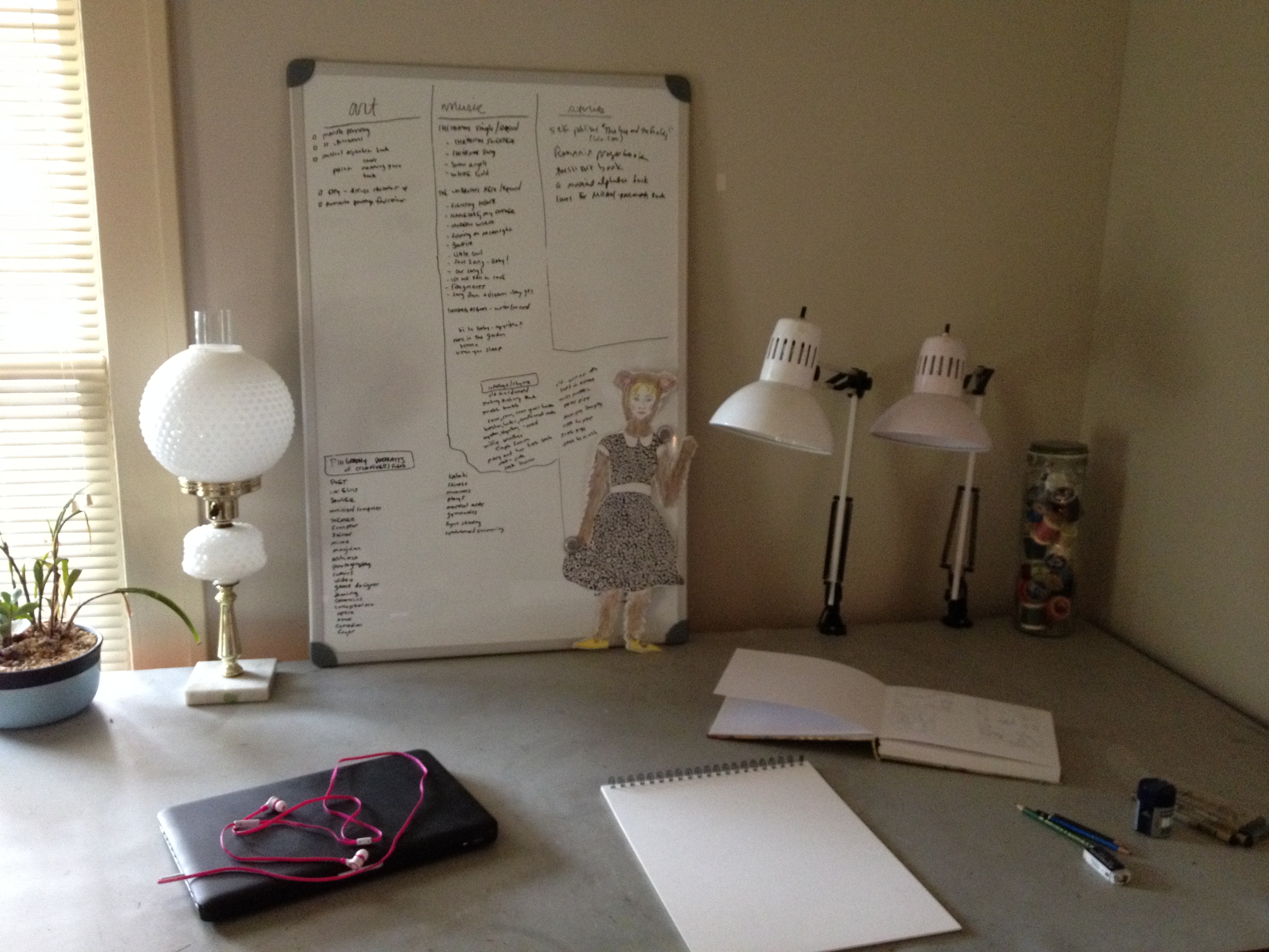
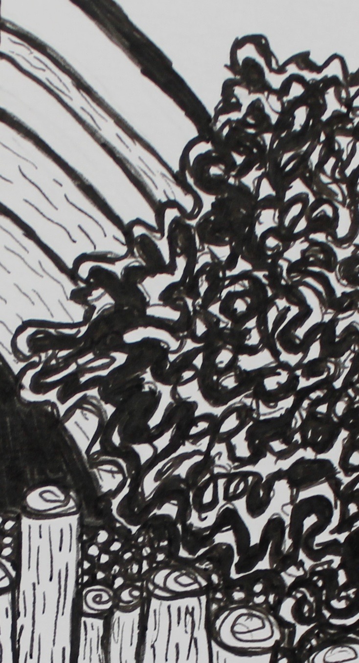
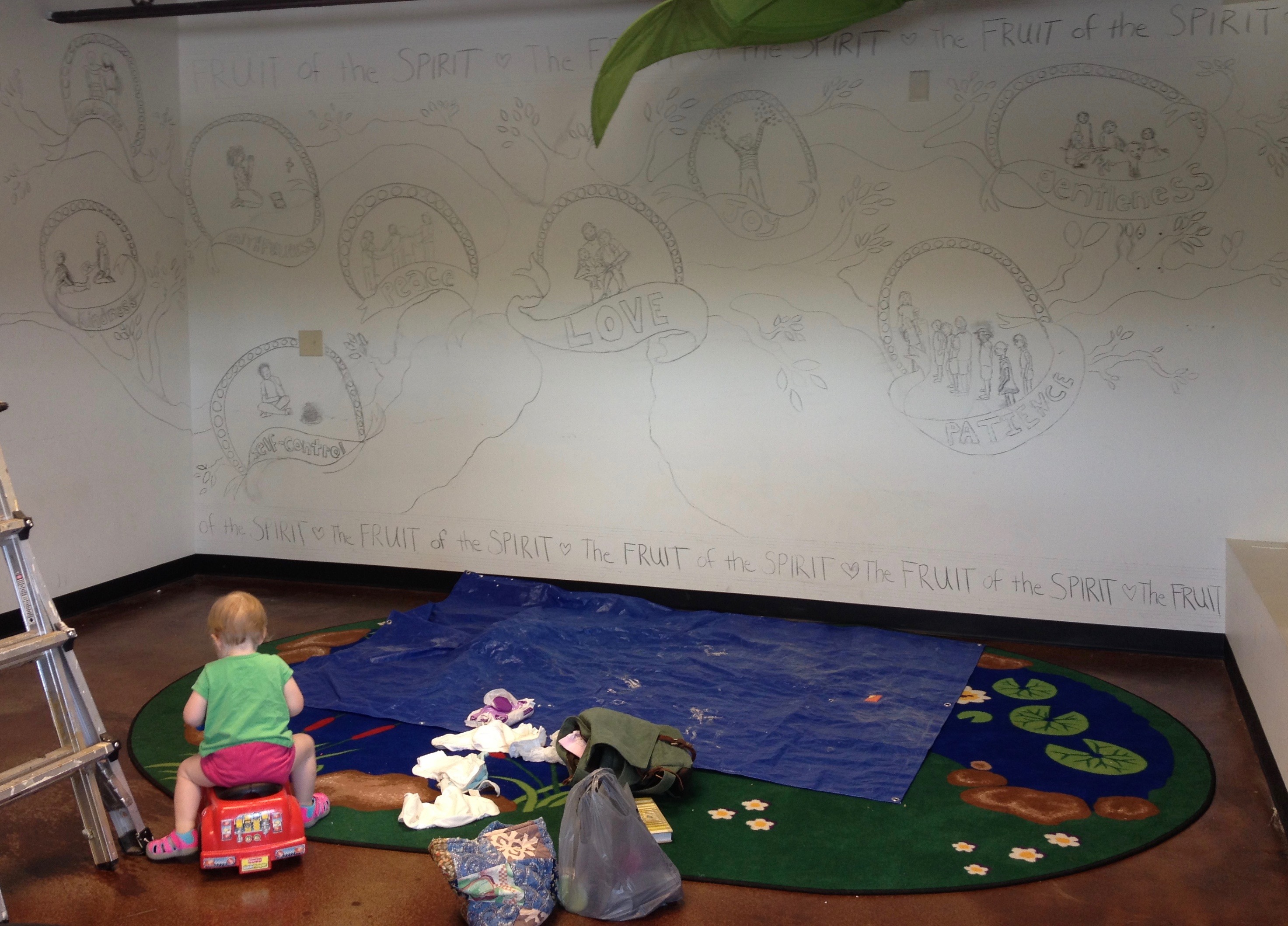
I drew up the top and bottom borders with a ruler and pencil.  The projector I use sometimes was too small to cover such a large area. So, I just freehanded the mural using willow charcoal.


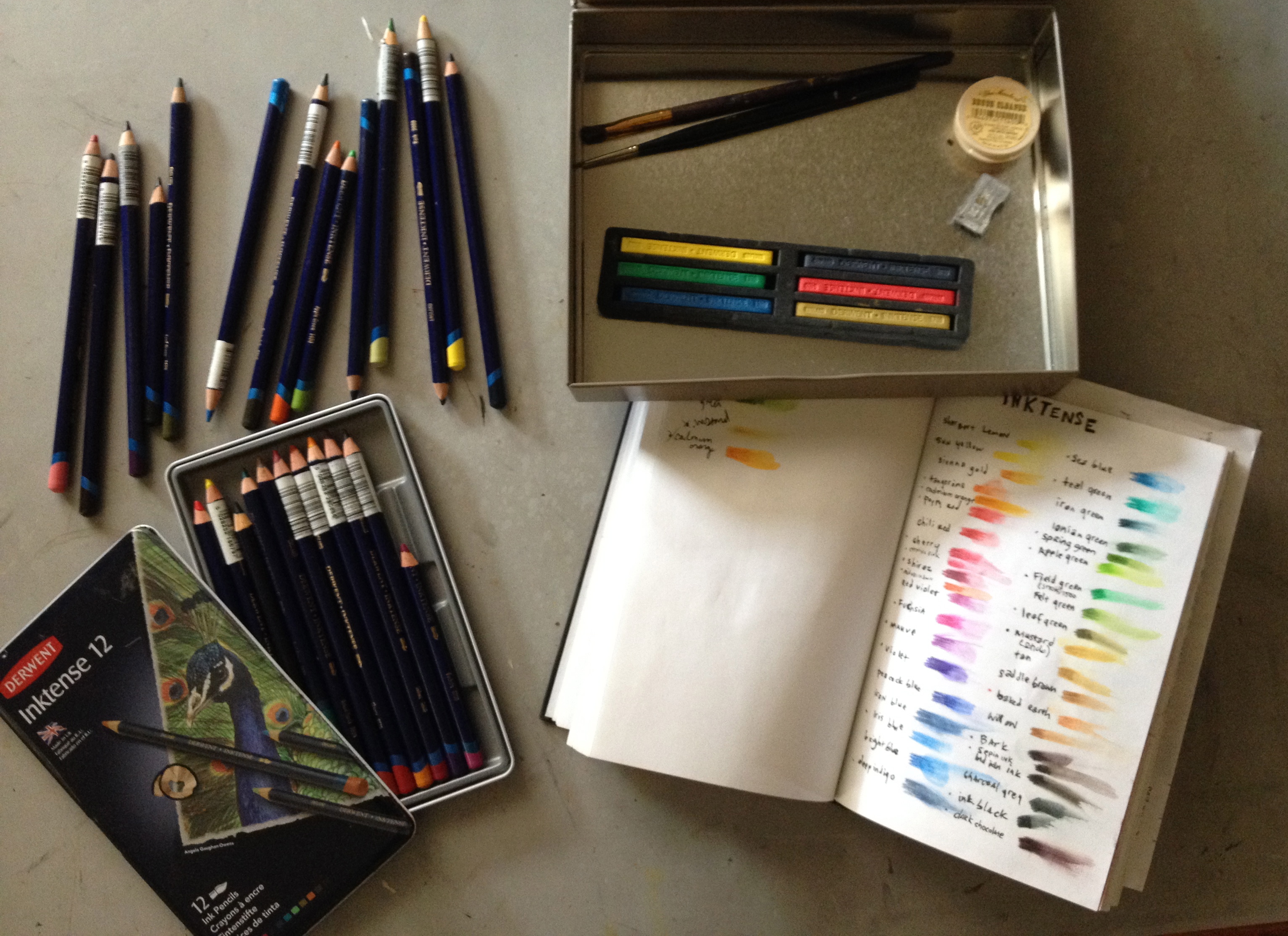
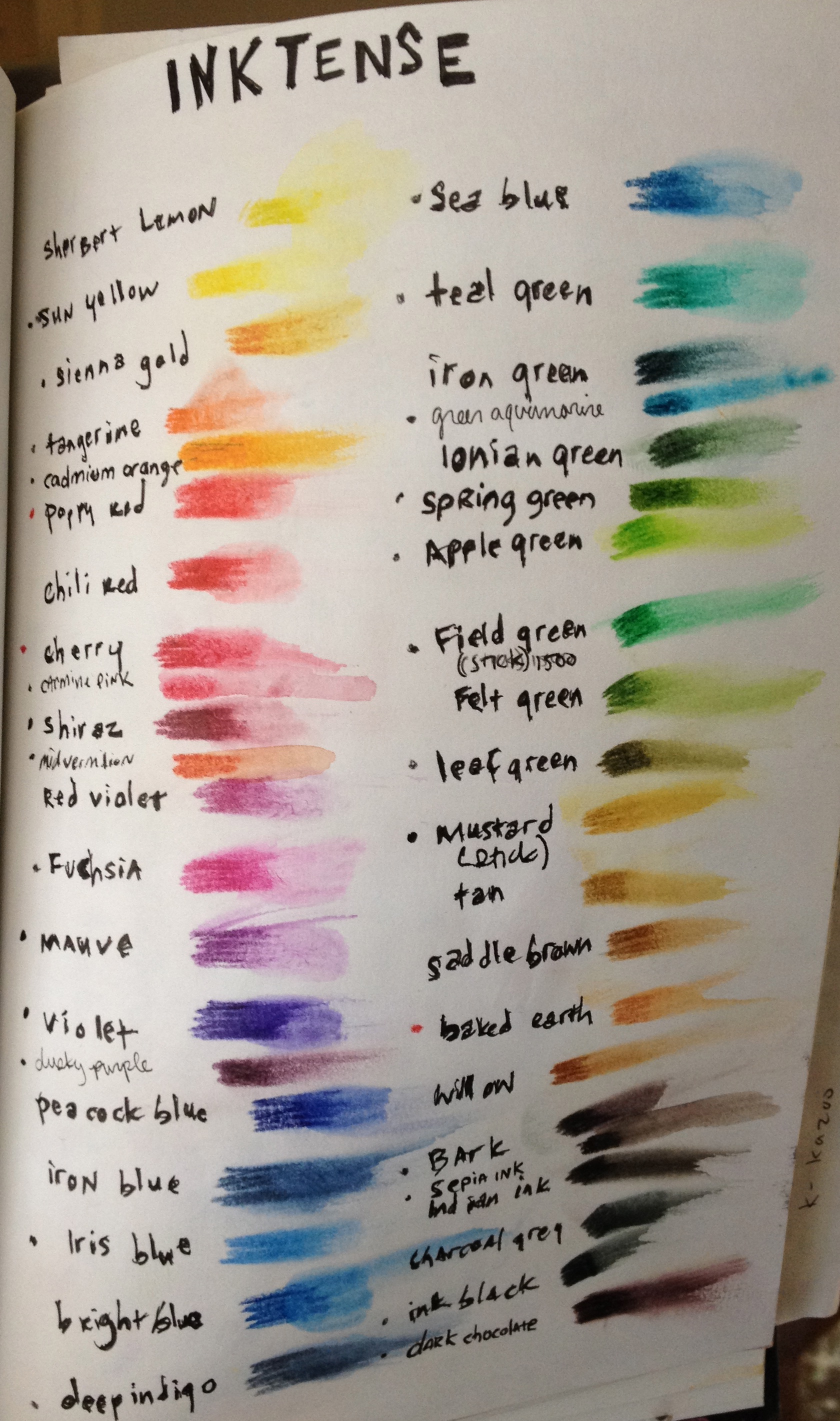
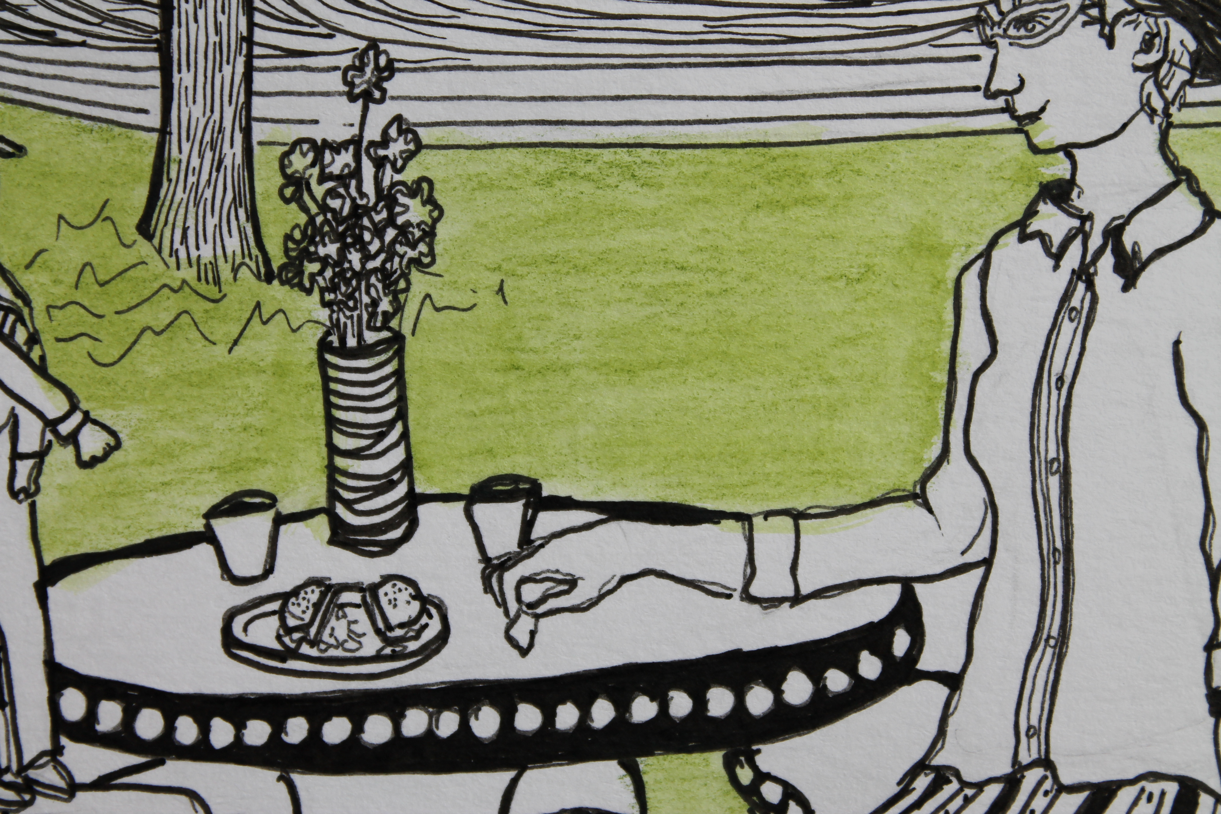
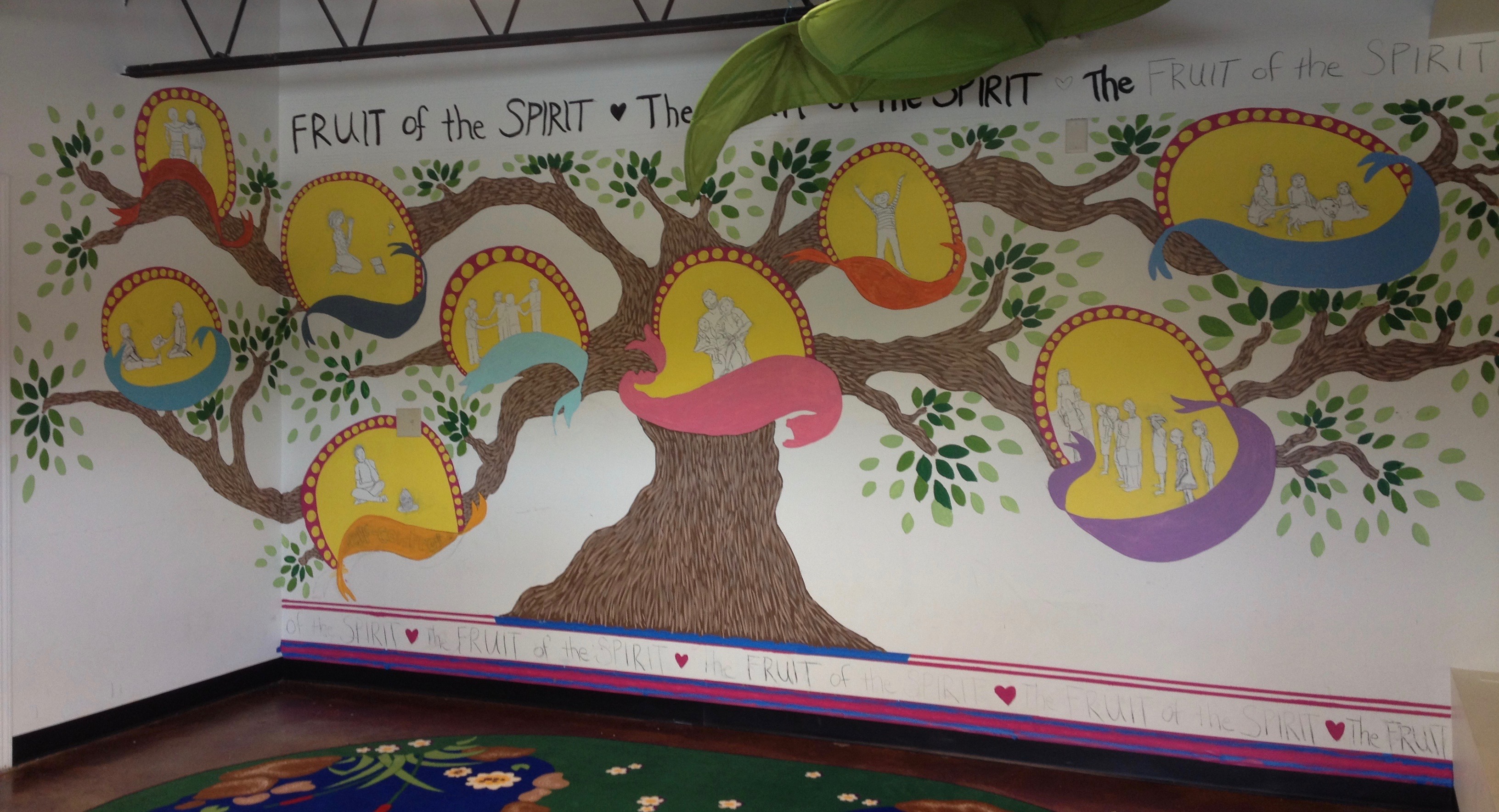
I then printed out copies of the sketch and used inktense pencils to decide the color scheme for the mural.

I used Velspar house paint samples from Lowes to paint all of the mural except for the scenes with the people, which I used acrylic paint. It took three to five coats of the house paint for some colors to cover the wall.

A couple of my artsy/artist friends Kara, Lindsay, and Stashia came to help me paint while our kids had a playdate (now that’s multitasking at its finest). And of course M jumped in a bit to help paint as well.

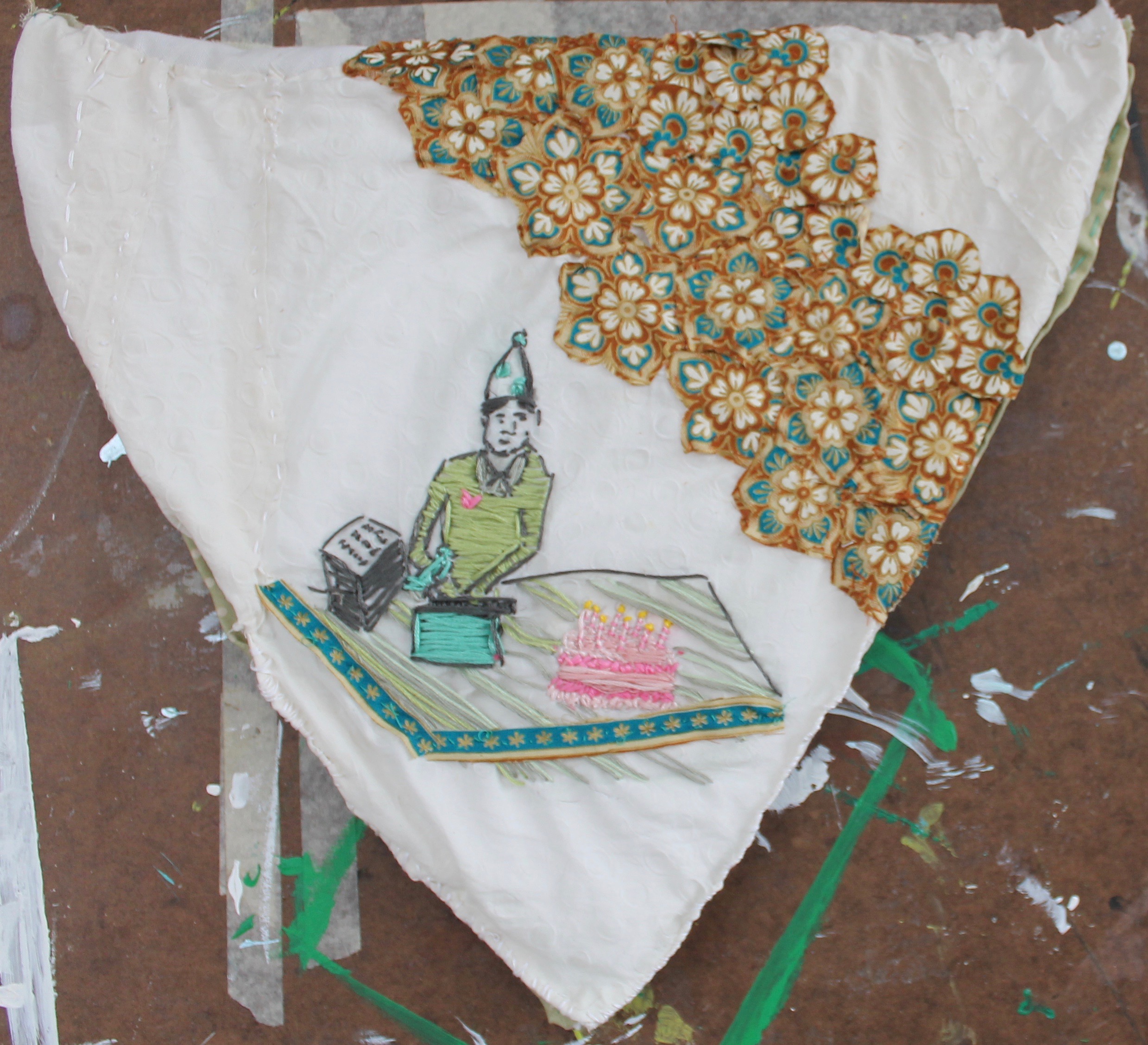
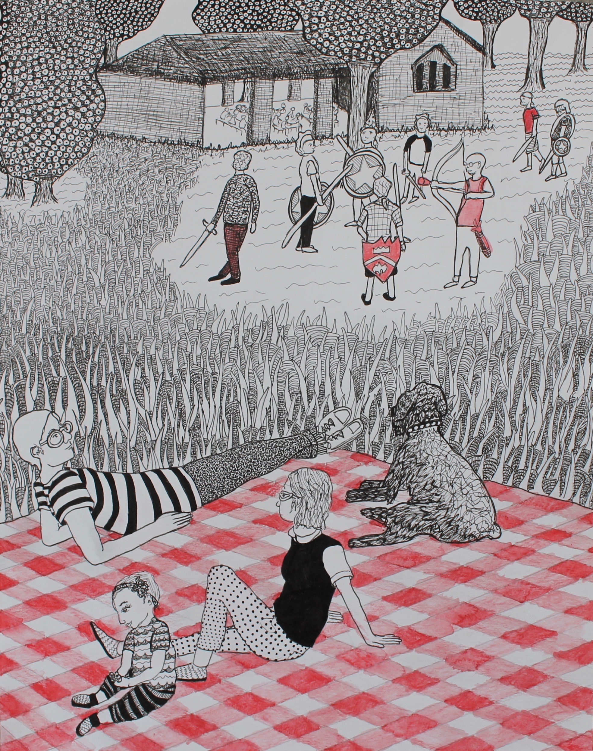
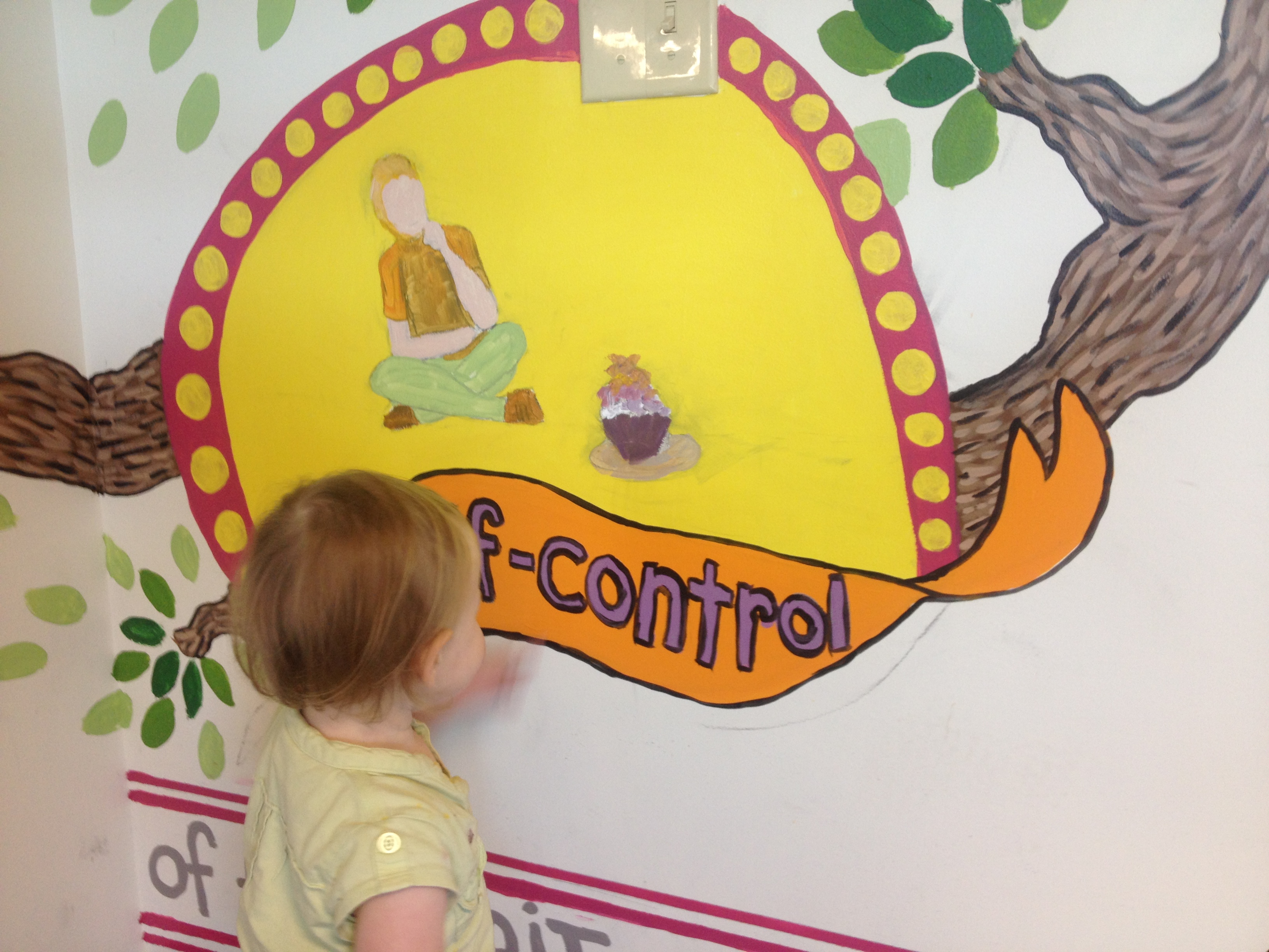
E loved the scene depicting self-control. She kept pointing to the cupcake saying “cupcake” and then pretend eating it with her pincher fingers and making “mmm” noises.

M and our daughter E would go with me most days and sometimes my friend Lacy from Gallery Gal would also meet me because she was painting the Lord’s Prayer on another wall. It took me about three months to complete (going about three times a week for roughly one hour each session).


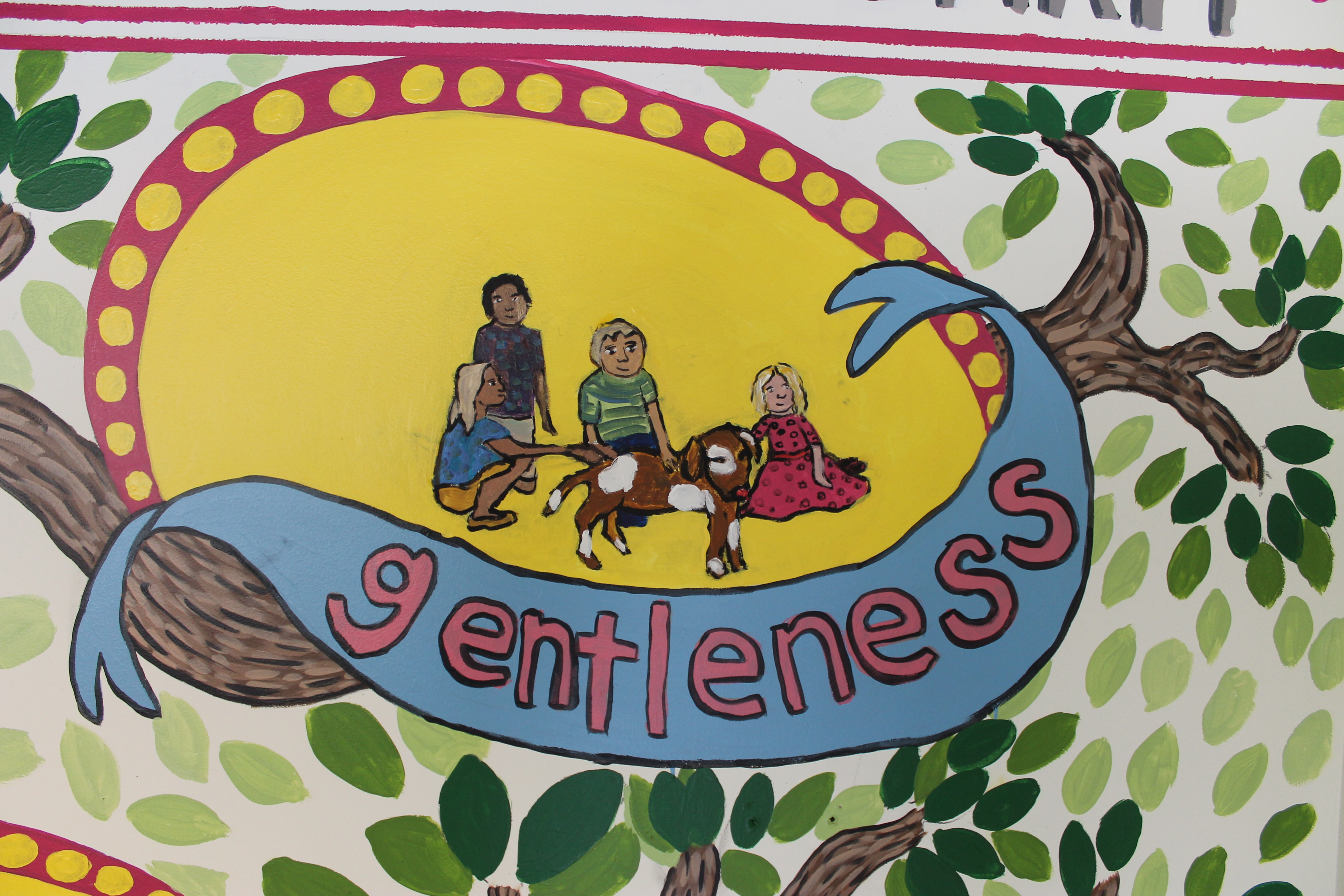
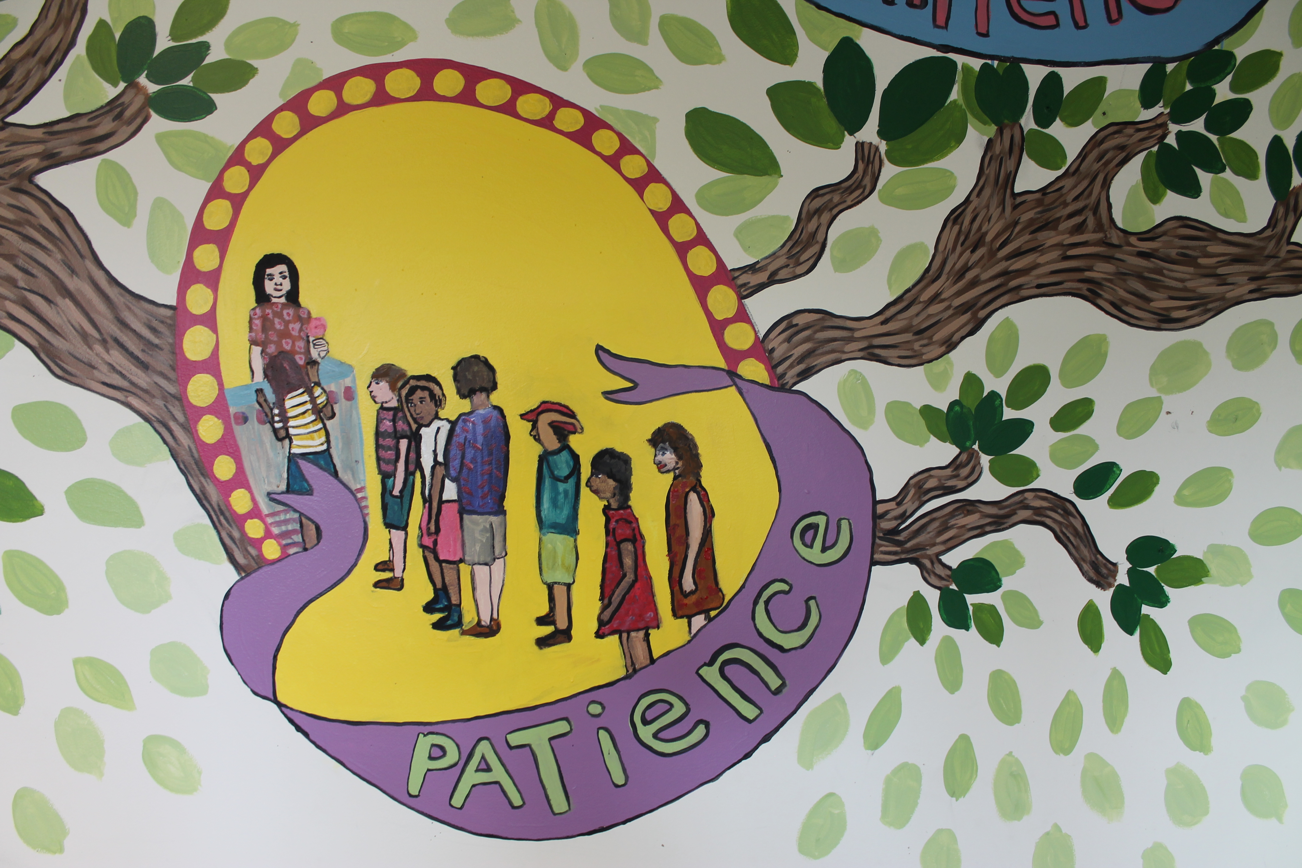
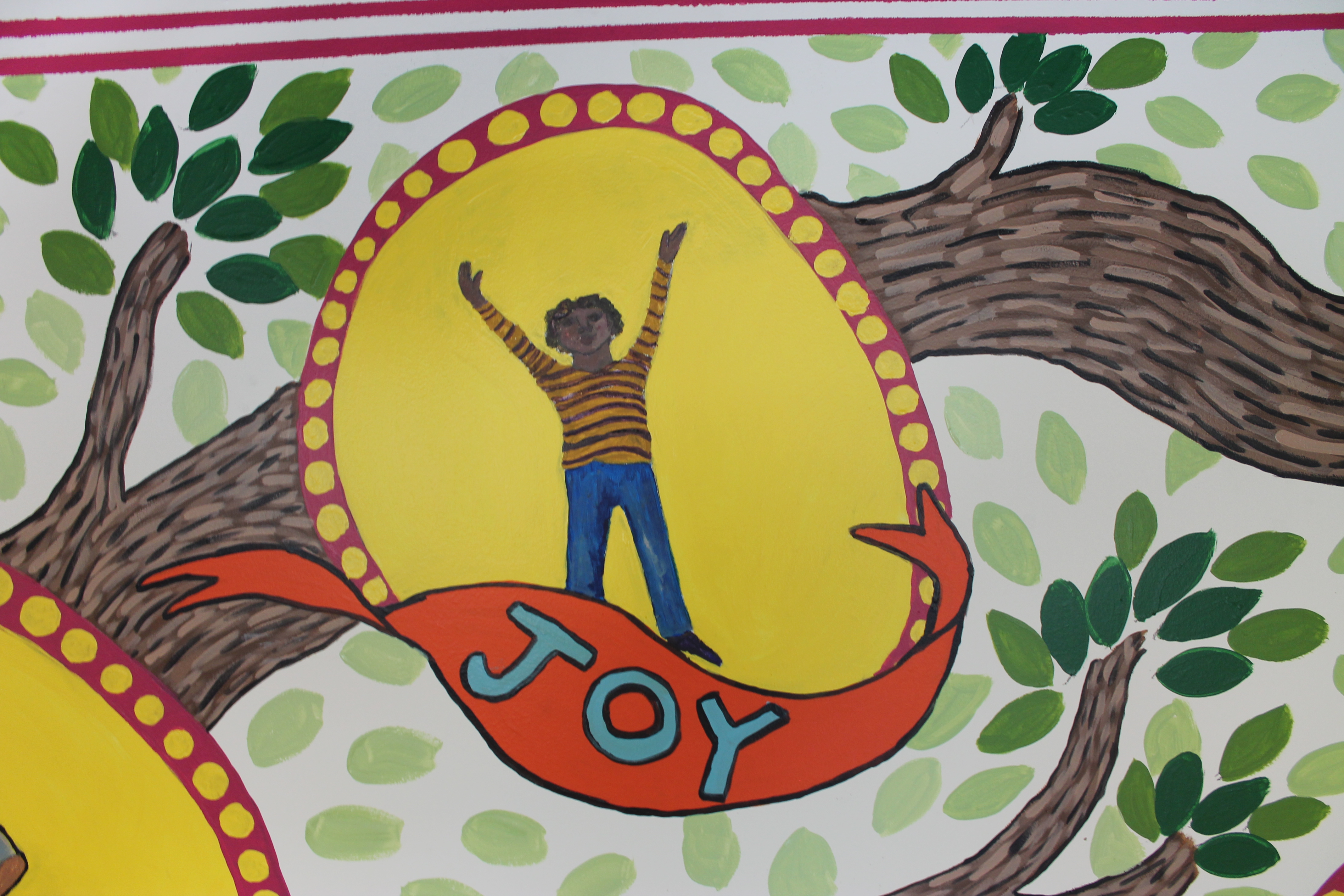
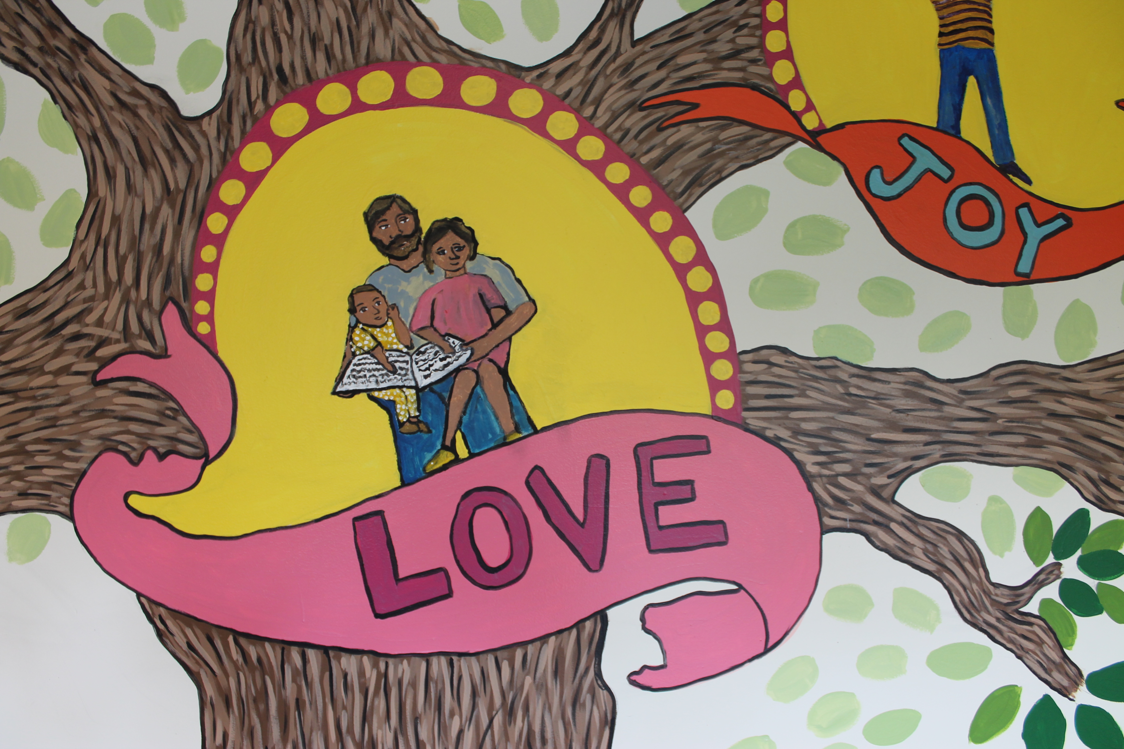
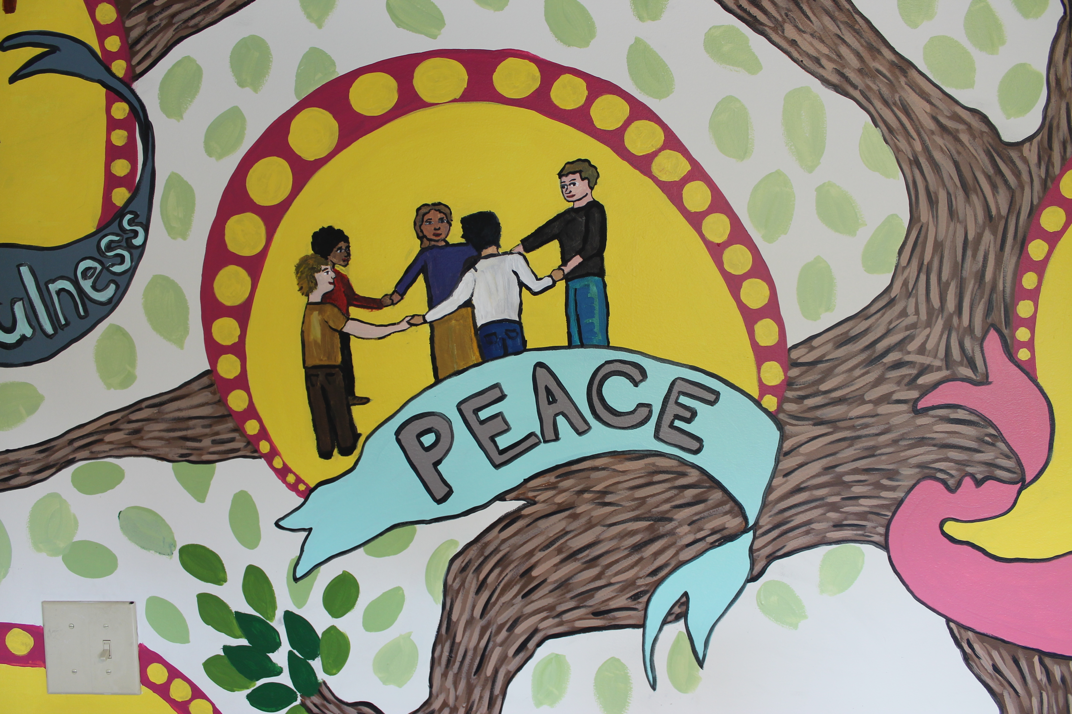
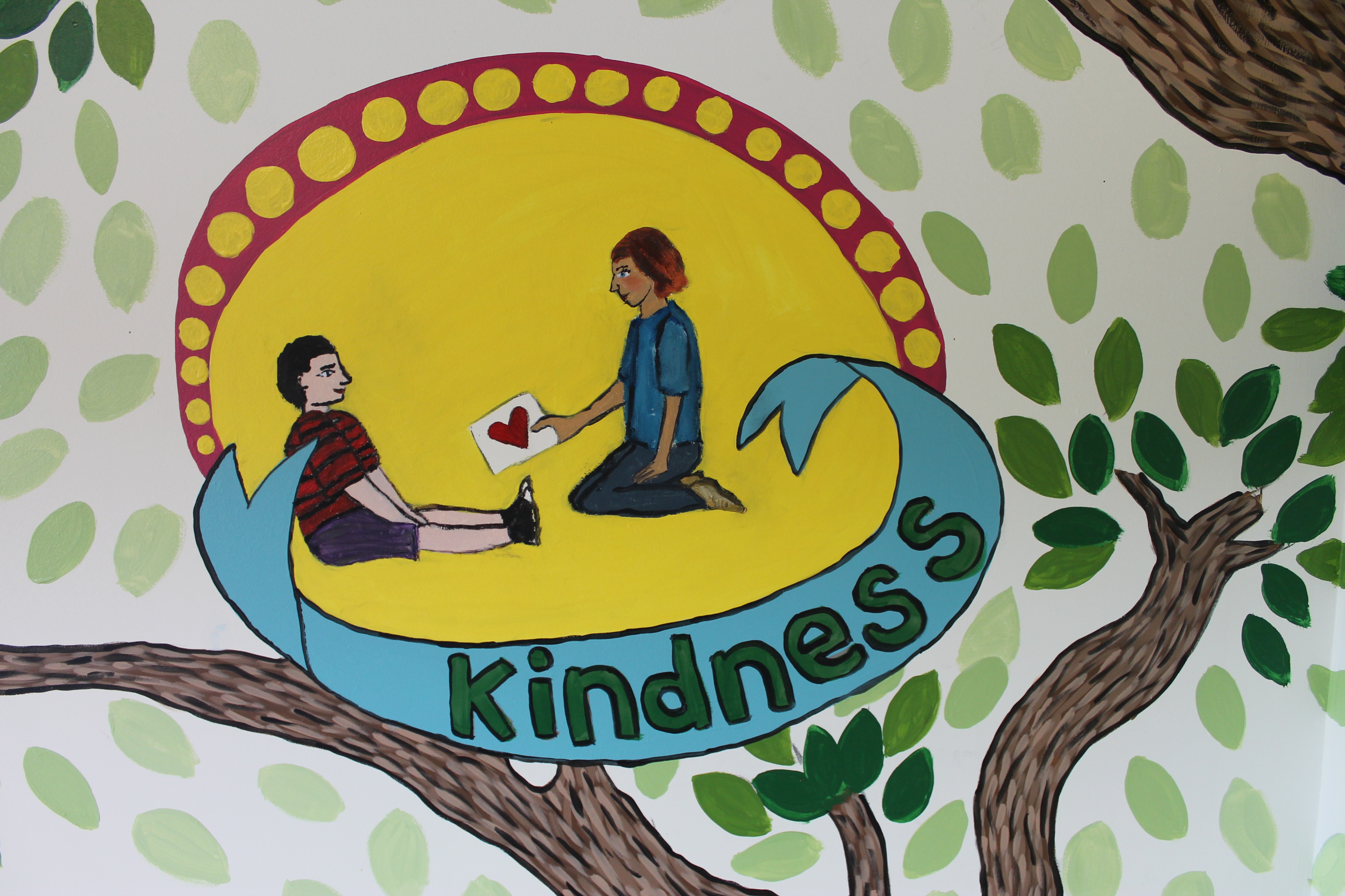
Hopefully this mural will not only make the space more fun and enjoyable for the kids, but it will also make it easy for them to learn the fruit of the spirit: love, joy, peace, patience, kindness, goodness, faithfulness, gentleness, and self-control.

Advertisement

15 Illustrations: Getting Ready

I am working with Inktense pencils, Micron ink pens, and Canson Illustration 11×14″ 150lb art pad to create 15 illustrations (that is how many pieces of paper are in the art pad) of my current family life and inspirations.


This work is narrative in content and uses color in a monochromatic way accentuating one part of each drawing. These fun and quirky illustrations are a reflection of the current joy and activities I have been experiencing.

“Getting Ready” is the first and last drawing in the series. I drew it at the beginning of the series and it’s a bit of a “nesting” time before E was born. I wanted to discover during this series how our lives would change socially and in our community once we had a baby. After finishing the drawing, I decided to color each pendant from each of the drawings in the series (which made this drawing technically the last one completed). The colors would eventually represent all of our adventures together, but in the drawing it would just be my daydream.

Before, with no color

The colors used are Inktense pencils: Sun Yellow, Leaf Green and Teal Green blended, Carmine Pink and Tangerine blended, Carmine Pink, Spring Green, Fuchsia, Iris Blue and Mauve blended, Mustard, Saddle Brown, Poppy Red, Cadmium Orange and Tangerine blended, Leaf Green, and Mauve and Violet blended.

My favorite things about this drawing are the crayon books and snail bookends,


the new mom, dad, and dog sister waiting for baby,


the embroidery and flowers.

and the completed embroidery.


15 Illustrations: Exploring the Japanese Stroll Garden

I am working with Inktense pencils, Micron ink pens, and Canson Illustration 11×14″ 150lb art pad to create 15 illustrations (that is how many pieces of paper are in the art pad) of my current family life and inspirations.


This work is narrative in content and uses color in a monochromatic way accentuating one part of each drawing. These fun and quirky illustrations are a reflection of the current joy and activities I have been experiencing.

“Exploring the Japanese Stroll Garden” is just one of many times we have been to the Mizumoto Japanese Stroll Garden in Springfield, MO. We all love to walk around and explore what the different seasons have to offer in the garden. It is such a relaxing and calm place to be. I used Inktense pencils Mauve and Violet blended for the purple blooming trees.

My favorite things about this drawing are the bridge and Micah and E looking off of the bridge,

all of the nature textures – the pebbled ground, trees, and bushes,


the rock pathway and log edging along the water,

and Ein and I watching the ducks.

Inspiration for this drawing


15 Illustrations: Watching the Larpers at Phelps Grove Park

I am working with Inktense pencils, Micron ink pens, and Canson Illustration 11×14″ 150lb art pad to create 15 illustrations (that is how many pieces of paper are in the art pad) of my current family life and inspirations.

img_7129
img_7138 img_7135 img_7134

This work is narrative in content and uses color in a monochromatic way accentuating one part of each drawing. These fun and quirky illustrations are a reflection of the current joy and activities I have been experiencing.

“Watching the Larpers at Phelps Grove Park,” was something we did a hand full of times last fall. Larpers are live action role-players “where the participants physically act out their characters’ actions. The players pursue goals within a fictional setting represented by the real world while interacting with each other in character.” (via Wikipedia) When the weather is nice out the Larpers and their families meet up at Phelps Grove Park on Sunday afternoons and play for a couple of hours. We always think it would be fun to let Ein off leash and yell “Warg attack!” – but of course we do not do this. I used Inktense pencil poppy red for the picnic blanket and one of the Larpers’ teams. I have really been wanting to use red, but it’s such a vivid color that it was hard to find a place for it until this drawing.

img_9673

My favorite things about this drawing are the Larpers,

img_9636

the nature (trees and grass) patterns,

img_9638 img_9640

our family (dad, mom, baby, and dog),

img_9641 img_9642
img_9643 img_9644
img_9645

and the picnic blanket pattern and polka dotted pants.

img_9646  img_9649

Inspiration for this drawing
img_2583 img_6369

15 Illustrations: Easter Picnic at St. Andrews

I am working with Inktense pencils, Micron ink pens, and Canson Illustration 11×14″ 150lb art pad to create 15 illustrations (that is how many pieces of paper are in the art pad) of my current family life and inspirations.

Derwent-Inktense-Pencil-12-350 IMG_2299

This work is narrative in content and uses color in a monochromatic way accentuating one part of each drawing. These fun and quirky illustrations are a reflection of the current joy and activities I have been experiencing.

“Easter Picnic at St. Andrews” was something we did back in March that really stuck in my mind. It was a gorgeous day, sunny and warm. St. Andrews Church has an amazing family program and hosted this really fun and laid back picnic and Easter egg hunt the Saturday before Easter. We went to this event and actually brought a picnic lunch – though we realized once there that the “picnic” was more like pick up some food after the egg hunt. We found a table and enjoyed our picnic fully.

I used Inktense pencil Spring Green for the color. This drawing was a bit of a challenge to chose what color and where to put it. I’m not fully convinced I made the right decision on either front, but it’s done now.

img_9396

Some of my favorite details are the stone and pebble pathway leading to the church, the Easter egg basket and bench,

img_9407 img_9405

my make believe patterned skirt, our fun picnic food and flowers, M and E’s portraits,

img_9410 img_9411 img_9412

our family portrait,

img_9397

and the church windows and architecture.

img_9408

The inspiration for this drawing:

img_2041